• ℹ️ Heads up...

    This is a popular topic that is fast moving Guest - before posting, please ensure that you check out the first post in the topic for a quick reminder of guidelines, and importantly a summary of the known facts and information so far. Thanks.

[The Smiler] Construction Updates and Ride Speculation

Status
This topic has been locked. No further replies can be posted.
GaryH said:
The one thing I am wondering and which hasnt been touched on at all is where Marmalade comes into this, and should all riders be armed with a slice of toast when boarding the ride......

It better not have *Censored* BITS IN!
 
As I have said before, The Sanctuary was setting the context for The Smiler. It was not showing what The Smiler would be like. You are fooling yourself if you thought The Smiler would have an identical theme to The Sanctuary. I can't remember exactly but the video's in the queue for The Sanctuary claimed that modernisation was not present in the facility. It was clear the The Smiler would be a more modernised facility with more 'up to date' techniques of marmalisation.

Also, you can't suddenly say this won't be sinister based on a few concepts released today. Personally I think it is quite sinister anyway. As far as I am concerned nothing at all has changed because of today's developments. It is all exactly as I was expecting and it is all fitting together really nicely.

:)
 
GaryH said:
The one thing I am wondering and which hasnt been touched on at all is where Marmalade comes into this, and should all riders be armed with a slice of toast when boarding the ride......

It doesn't happen often when reading things online...but that really did make me laugh out loud.

Yes, there have been two ridiculous terms banded around in relation to this ride. Firstly, "marmalisation" and secondly the "staffordshire knot". Can't decide which is worse/funnier :p

:)
 
Dunno why but the "Staffordshire Knot" and the background regarding this ride (i.e. a warped mental health institution) for some reason makes me think it is a vasectomy lol

Patient : Hello Dr, i'm feeling a bit frisky

Dr K : No problem, we will give you a Staffordshire Knot to cure you of your urges
 
I'm just glad that they're going all out on the theming front this time. There'd be nothing worse than another Rita style unthemed coaster going in, everyone would be livid. As it is, even if there is a mild clash between Oblivion and The Smiler, the fact remains that they're still putting in a huge structure that is completely devoted to the theme. I personally think it looks great, and if fabricated well and done properly it will be a sight to behold in X-Sector next year.
 
Rob said:
As I have said before, The Sanctuary was setting the context for The Smiler. It was not showing what The Smiler would be like. You are fooling yourself if you thought The Smiler would have an identical theme to The Sanctuary. I can't remember exactly but the video's in the queue for The Sanctuary claimed that modernisation was not present in the facility. It was clear the The Smiler would be a more modernised facility with more 'up to date' techniques of marmalisation.

Also, you can't suddenly say this won't be sinister based on a few concepts released today. Personally I think it is quite sinister anyway. As far as I am concerned nothing at all has changed because of today's developments. It is all exactly as I was expecting and it is all fitting together really nicely.

:)

Indeed you are correct Rob! The video stated "Thank you for taking part in the process ahead of our revolutionary project in 2013. You will realize modernization is not apparent inside The Sanctuary, for this will allow us to get a true understanding of the previous issues we have had with our system!"

Thus meaning, it was an 'Advocate Trial' to allow them to analyse the faults and failings and fully improve/modernize the marmalisation system! Causing The Smiler to work efficiently and successfully!

So yes, The Sanctuary is linked with the ride, as a build up/introduction, a prequel if you will. However it has a very different theme to The Smiler, while still keeping the key elements of the story/process!


In terms of voicing my own opinion, I can't wait to take part in the new procedures and get inside the modern facility! The 'Marmaliser' looks AMAZING! Far better than the original concepts, so much going on, I have to say, the queue for this ride will struggle to be dull with so damn much to look at! I think the theme fits in just fine and compliments the existing area perfectly! :D

Roll on more updates! :)
 
Now you mention the queue line....I hope to god the plans have changed too regarding the cattlepen.

I don't get why the queue can't go up up the hill and then stretch behind the vertical lift hill before going back down the slope towards the station. Now that would really build anticipation...
 
CoasterCrazyChris said:
Now you mention the queue line....I hope to god the plans have changed too regarding the cattlepen.

I imagine that will be pretty much the same tbh! They have so little room to do anything other than that really, even less now they have dug the massive pit! Let's face it, this ride is going need the space to accommodate a large queue, and with the space they have to play with a dense cattle pen is the only way to do it unfortunately! :(
 
I really like how quickly progress on the ride is moving along, it really is starting to look great.

However, the theming, in my opinion is clashing way to much with the rest of X-Sector, and although I have no issues with them going all out on the main feature and how it will interact with The Smiler, I fear there will be way too much yellowness. If you look at Oblivion, (pre fanta) there was barely any orange visible on the buildings or theming, what was included were the orange chevrons around the place, these really did look great, and still do. In my head, the marmaliser should be painted mainly black, but with yellow chevrons.

Also I always notice that X-Sector has a destict 'pipe' design that is present on the Fried Chicken Co, XCell/XPose, Rehydrator, Submission and Enterprise entrances, and the Oblivion queueline. Where are these on the Smiler? No where to be seen it seems. These I think are an essential part of the areas theme and should ideally be included on the station somewhere.

Sorry to rant on, but I fear when the ride is complete we will have a terrible overpowering of yellow, which should be subtle really, just like Oblivion's orange. Also in regards to the Marmaliser, I think simpler is better hear, the whole of X-Sector is fairly plain in style, but it works, whereas like others have said the marmaliser seems to suit Forbidden Valley more.
 
This is a clever ploy.

If parents get the idea that, their teenage kids may actually get a wash on The Smiler, they will be taking them there in their droves!!

They should market it like that!

"We can hypnotise your children to be happy, and send them home washed and clean".
 
I do find the comments of people saying it looks too cartoony a bit comical.

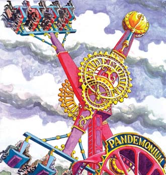
It's artwork and will always look over the top compared to the final result.

Take the following example

180204-Pmonium.jpg
 
If they are planning on adding a "tickler" in some form, it'd be funny if it was some kind of giant rotating drill or some blades:
PELLEN3_FEATURE__F7585846_75141.JPG


Rider: "Oh, what's this? The Tickler? Doesn't sound so bad!"
*sees giant rotating blade/drill contraption hurtling towards them*
Rider: "Oh ****!"
:p

Still don't think any of this goes with Oblivion very well but I'll have to see once it is finally open.


Edit: Don't know if this has been posted before but TTF put this on their Facebook...
65990_10151550316858185_773183940_n.jpg
 
I think it looks fine...

Indeed, it could provide an interesting on AND off ride viewing experience, which is something that Merlin are leaning back towards after the relative issues with Saw and Thirteen's queues showing nothing of worth at all...

Even if this is a giant cattlepen, it'll be located underneath the ride and this structure... Which will be impressive enough as it is...

As mentioned as well, concept art is always needed to be taken with a pinch of salt, due to the fact that it is created to put forward an idea or indeed, a concept... Then the design team get a hold of it and see what they can do...

It could well end up looking a completely sinister beast in the end, either option of it fitting or not can only be determined when it's finished and built, not before... The difference between some concept arts and real-life can be absolutely gigantic...

Either way, this object is extremely Disney like in it's design in a bid to draw attention to the attraction (not that the tangled mess of track needs it), but more in a case of having a very different and striking visual partner to the track, with some extra visual stand-outs in the effects...
 
Large theming object, long layout, inside section, good use of limited space, original theme, sits better in it location than air vs nemesis, Rita vs well, all of dark Forrest.

Developed theme, rather than shipping containers, usual AT rubbish.

It's ok not to love it but hey-ho, look at what we are getting, what we have wanted for years, at least on paper, just got to wait for the ride to open and to see it in the flesh?

Yes it's something we haven't had for years, lets embrace it even if we don't love the concept and the tackiness.

All the above only applies if grestache is emitted, otherwise, jog on!
 
This thread is moving so fast!

Lots of people are saying it doesn't go with Oblivion. Fair enough it doesn't match the visual style of Oblivion, but then again Oblivion is so minimalist that it barely has a visual style. However the ride does add a new dimension to the sinister undertones of X-Sector and Oblivion - and is quite bold in portraying what the ride is about.

I honestly think this will impress people! :D
 
Rob said:
So are you still in your relationship with Merlin's marketing director? Are you still certain of a beyond vertical drop that isn't being built?

And, you said you played the game and the layout was exactly the same as on the plans. Which game were you playing? As the layout isn't the same.

Time to give up your little game, no-one is ever going to believe anything you say again.

:)

No Im not still in a relationship with him. And Iv explained about the things I got wrong.I took rumours at Merlin to be gospel because it's Merlin..How wouldn't they know? Well Alton Towers has its own marketing department. So everything I heard turned out to be rumour.

As for the game..The layout was exactly like the plans. I don't know if you had the chance to play but it consists of unlocking elements that differ from the plans, the one I tried did not have inverting drops and was identical to the original plans because the extra inversions hasnt been unlocked on the guys iPad.

And finally, I'm not playing a game. I really dont care what anyone thinks, I know what I have said and why I have said it, my only mistake is relaying what were always just rumours as absolute fact, but the washing machine element is not and has never been a rumour, just plain fact. I'm not posting here again until its built then I will merely post a troll face and take my ass over to towers times.
 
Re: Re: [The Smiler] Construction Updates and Ride Speculation

spin_doctor said:
As for the game..The layout was exactly like the plans. I don't know if you had the chance to play but it consists of unlocking elements that differ from the plans, the one I tried did not have inverting drops and was identical to the original plans because the extra inversions hasnt been unlocked on the guys iPad.

Actually no, the game doesn't have the same layout even if you ignore the additional inversions you unlock, its missing the two dive loops in the first half.
 
Just went into Tesco and saw a large advert for The Sun with The Smiler all over it.

Had a quick glance inside and there was a very realistic looking image of the trains going through an inversion. The trains had lap bars and looked just like that new piece of marketing seen at half term.

Sorry I haven't got a picture.
 
It looks ok. I preferred the original structure with the covered framwork and spikes, it looked more solid and modern, while the new one, with the tubes and open framework, looks a bit 'Forbidden Valley'. But all the stuff coming off it will look petty impressive.

I'm not sure how the car wash thing is going to be of any use, but the mist, water spray and flashes should be pretty good.

It's a bit silly and over the top, but isn't that the point? It's going to be impressive either way, especially if the pit isn't being covered and guests can walk around the legs like recent images and the game suggest.
 
Status
This topic has been locked. No further replies can be posted.
Top