- News all the latest
- Theme Park explore the park
- Resort tour the resort
- Future looking forward
- History looking back
- Community and meetups
-
ℹ️ Heads up...
This is a popular topic that is fast moving Guest - before posting, please ensure that you check out the first post in the topic for a quick reminder of guidelines, and importantly a summary of the known facts and information so far. Thanks. - Thread starter Ted
- Start date
- Status
- This topic has been locked. No further replies can be posted.
- Favourite Ride
- Hyperion
- Favourite Ride
- Journey to the Center of the Earth
- Favourite Ride
- Ug Bugs
- Favourite Ride
- Your Dad
- Favourite Ride
- Monsters Unchained: The Frankenstein Experiment
- Favourite Ride
- Ug Bugs
- Favourite Ride
- Hyperion
- Favourite Ride
- Your Dad
- Favourite Ride
- Ug Bugs
- Favourite Ride
- Monsters Unchained: The Frankenstein Experiment
- Status
- This topic has been locked. No further replies can be posted.
You are using an out of date browser. It may not display this or other websites correctly.
You should upgrade or use an alternative browser.
You should upgrade or use an alternative browser.
Thorpe Park: General Discussion
Connor98
TS Member
If it was Dynamos ghost train would you refer to it as “straight magicians VR gash train” ? Very odd phraseologyGay magicians VR gash train
KolonelKlink
TS Member
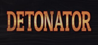
Detonator’s new logo is out and it’s - as you’d expect - stretched Word Art:
From: https://x.com/thorpepark/status/1758197000988999776?s=46&t=OuG-53CJRHzzDVEPmDXGSg
From: https://x.com/thorpepark/status/1758197000988999776?s=46&t=OuG-53CJRHzzDVEPmDXGSg
Johnny Rocket
TS Member
It’s serving Planet Coaster custom text signage VIBES
Zeock
TS Member
Detonator’s new logo is out and it’s - as you’d expect - stretched Word Art:
From: https://x.com/thorpepark/status/1758197000988999776?s=46&t=OuG-53CJRHzzDVEPmDXGSg
That logo is very poor, to say the least.
GooseOnTheLoose
TS Member
I would imagine that the Black Mirror IP was up for renewal, or rather the general agreement with Netflix. The novelty has worn off slightly and the whole park does seem to be moving away from IPs slowly, thankfully. It might have made sense to execute the presumable break clause, rather than continue or renew when it came up.With a big ride opening this year, it’s a rather strange decision on the capacity side of things?
Ben
TS Founding Member
I’d have called it dull magician very gash trainIf it was Dynamos ghost train would you refer to it as “straight magicians VR gash train” ? Very odd phraseology
you might find it odd, but it is truthful. He is openly gay and a magician.
I have no issue with gays (being a homosexual myself) but Ive never “got” magicians, call it elitism, snobbery, whatever, it’s just entertainment for the uneducated.
The_bup
TS Member
Detonator’s new logo is out and it’s - as you’d expect - stretched Word Art:
From: https://x.com/thorpepark/status/1758197000988999776?s=46&t=OuG-53CJRHzzDVEPmDXGSg
Like it’s a downgrade. Ultimately it is a sign for a flat ride. All the flats in lost city is the same font over a different kaleidoscope-y background.
They could do better, but do we really care?
GooseOnTheLoose
TS Member
Just hand over the keys to the JCB now, before you really can't climb out of that hole.I have no issue with gays
KolonelKlink
TS Member
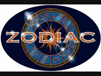
I do - there’s a world of difference between this:Like it’s a downgrade. Ultimately it is a sign for a flat ride. All the flats in lost city is the same font over a different kaleidoscope-y background.
They could do better, but do we really care?

and this:

If we’re going to go down the “oh it’s only a sign/logo for a flat ride” route then the park might as well not bother having any theme for any area and welcome visitors to each attraction with a laminated piece of A4 and the ride name typed in Arial point 72.
Connor98
TS Member
The new Thorpe Park logo really showed its flaws on The Sun’s promotional poster, it just sunk into the background and became almost unnoticeable unless looking for it.That Detonator logo genuinely looks like the sort of thing I threw together in WordArt for Office 95 when I was about 6.
Combined with the Thorpe Industrial Estate logo it’s really not a good look for their branding IMO.
TroySmith1
TS Member
The big new ride is significantly higher capacity than a mirror maze.
The big new ride will draw more people to the park they still need fillers is what I meant.
Sent from my iPhone using Tapatalk
Ben
TS Founding Member
Care to read the rest of what I wrote?Just hand over the keys to the JCB now, before you really can't climb out of that hole.
TroySmith1
TS Member
I’m more gutted the fake firework shop to the frontage looks nothing like the concept art seen on the last picture of the sparkle page.
Sent from my iPhone using Tapatalk
Sent from my iPhone using Tapatalk
GooseOnTheLoose
TS Member
I did. It didn't help. It's problematic rhetoric regardless of whether you have an affinity or not.Care to read the rest of what I wrote?
The_bup
TS Member
Fair, I did forget about the zodiac wheel in the background.If we’re going to go down the “oh it’s only a sign/logo for a flat ride” route then the park might as well not bother having any theme for any area and welcome visitors to each attraction with a laminated piece of A4 and the ride name typed in Arial point 72.

