• ℹ️ Heads up...

    This is a popular topic that is fast moving Guest - before posting, please ensure that you check out the first post in the topic for a quick reminder of guidelines, and importantly a summary of the known facts and information so far. Thanks.

Thorpe Park: General Discussion

I think it looks great, it is obviously a design choice to have some of the logo outside the edges of the box.

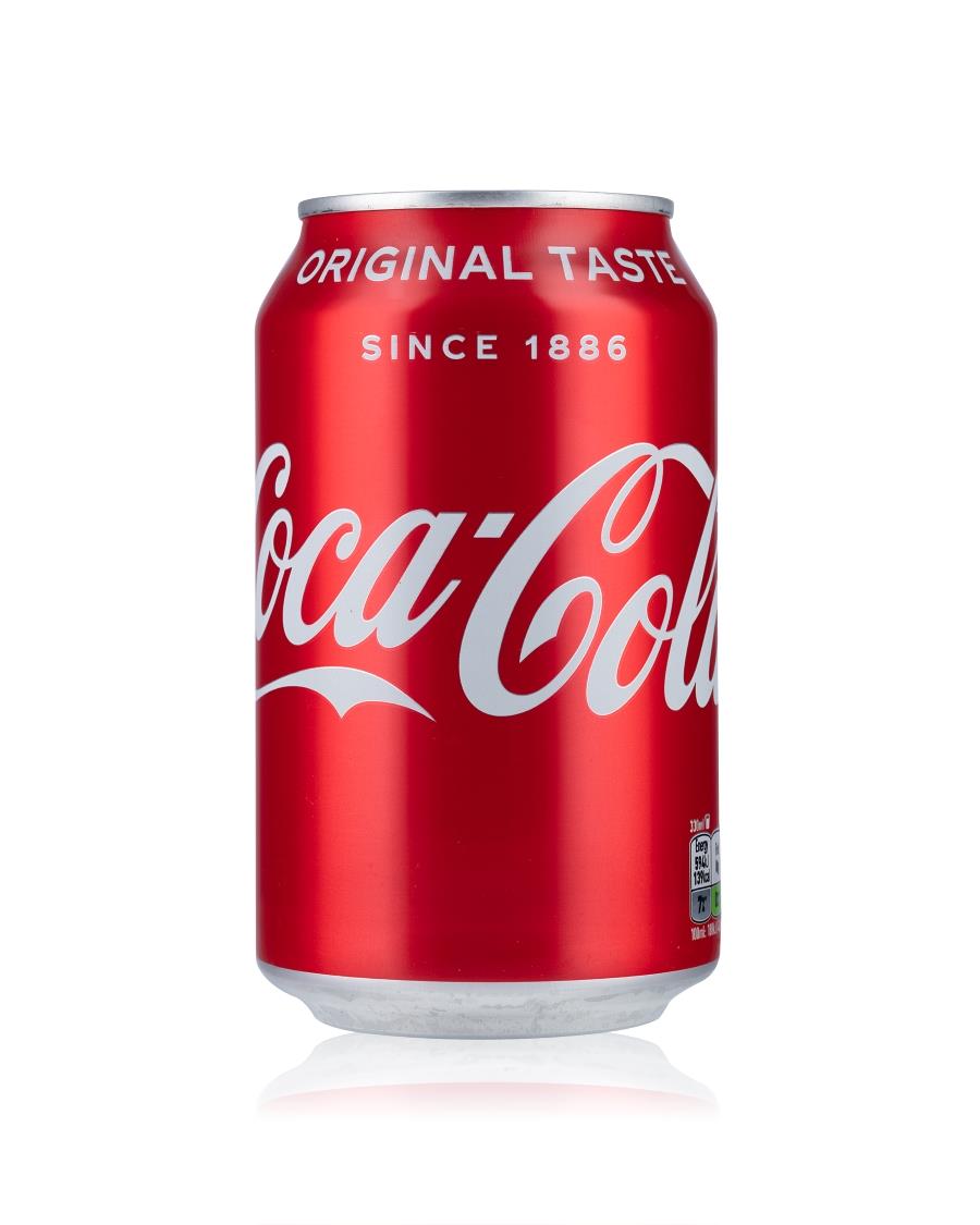
Its like the current Coke can where the first C and last a are missing when viewed from the front, but it still all makes sense
0402002.jpg
In that scenario though you are comparing the world's most recognisable wordmark, displayed in the colours most connected with the brand, on the product itself...

...with a brand new logo that the vast majority of people looking for the app will have barely seen in full before, and almost certainly never in those colours
For an app where the full name is written in text below, many other brands have even less of the logo in the icon. Icon branding is very different to other imagery as it doesn’t really matter because you enter “Thorpe Park” into the search box on the App Store, you don’t browse a shelf of icons looking for it.
 
you don’t browse a shelf of icons looking for it.
But that's exactly what most people do when using it. I don't know many people using search in their app drawer, or reading every label to find their app. Scroll down to the rough part of the alphabet you need, scan the images looking for colours or shapes that trigger recognition, click.

The problem isn't that the icon doesn't properly say Thorpe Park, it's that it doesn't really say anything, and has ended up as a kind of abstract representation of branding that, for people who have only used the website and booking site, has never been shown in those colours or in that layout. I can't find a single app that doesn't in some way reflect the brand, or the product, or the function of the app behind it.

This has one similarity to anything to do with Thorpe Park's brand, product or app function...a typeface. The brand new, barely seen, typeface.

It's a miss for me.
 
Last edited:
But that's exactly what most people do when using it. I don't know many people using search in their app drawer, or reading every label to find their app. Scroll down to the rough part of the alphabet you need, scan the images looking for colours or shapes that trigger recognition, click.

The problem isn't that the icon doesn't properly say Thorpe Park, it's that it doesn't really say anything, and has ended up as a kind of abstract representation of branding that, for people who have only used the website and booking site, has never been shown in those colours or in that layout. I can't find a single app that doesn't in some way reflect the brand, or the product, or the function of the app behind it.

This has one similarity to anything to do with Thorpe Park's brand, product or app function...a typeface. The brand new, barely seen, typeface.

It's a miss for me.

Most people will use the app for one day a year, as long as the logo matches the one above the park gate not a lot else matters. Yes there won’t be any recognition for a logo that’s only a few months old, same as 24 years ago most people would not have recognised the infinity swirly bubbles either.
 
Agreed, new logo is awful.

However - was going round the M25 the other day and the view of Hyperia… it is insane.

At its clearest point, (I haven’t checked the stats, so sue me) it looks double the height of Saw. Round here, the hype is building to insane levels.

Anyone reckon it’s gonna beat the Nemesis Reborn line on opening?
Saw is 100ft tall, and Hyperia is 236ft tall, so Hyperia is over double the height of Saw.
 
Visited today and had a good visit - not worth a full trip report but here’s some highlights.

The new 4d cinema is better than angry birds but still not really worth it, Saw was closed all day but other than that things seemed to be going well. All the coasters had their moments but comms were good, and things were back running within about 10-15 minutes. Ops were a bit slow, but hopefully this will improve as new staff get to grips with things. A lot of delay was caused by guests faffing - the new briefing screens are not yet in operation, hopefully they’ll have some effect when they are.

Service in the last call cafe was abysmally slow but doughnut time now offers 10% MAP discount (and has vegan options, and is bigger and cheaper than Project D at Towers). Mmmm… doughnuts…

The Mardi Gras stuff was a bit something and nothing but harmless enough, Big Easy Boulevard actually looks quite nice up close.

The park was busy but had a fairly chilled atmosphere - I sometimes find Thorpe can feel a bit on edge, not today though.

A visit to her favourite park has increased the Chimp’s morale to 100%, happy Chimp happy Alix, so all in all a good day.
 

Attachments

  • IMG_4216.jpeg
    IMG_4216.jpeg
    138 KB · Views: 58
  • IMG_4014.jpeg
    IMG_4014.jpeg
    504.3 KB · Views: 62
  • IMG_4026.jpeg
    IMG_4026.jpeg
    274.9 KB · Views: 64
  • IMG_4024.jpeg
    IMG_4024.jpeg
    733.9 KB · Views: 61
Well done to the media outlets who published the hoax two days early. Looking at the comments, people generally had read the article.
(Personally I think the media should stay out of April Fools in the modern age of fake news but that's a discussion for another time)
 
Walk around video here of the new Big Easy Boulevard. Whilst it is good to see the back of Angry Birds I’ve got to say this does look a bit dissapointing in terms of the finished product, it seems ok at best.

I wasn’t expecting the world with this but it looks a bit half arsed. Aside from the blocky paint which has been discussed on here before the flooring throughout the land looks awful.

It’s a random mix of tarmac old and new, block paving old and new, lines drawn on, covid social distance markers still not rubbed off. It looks a mess and just totally distracts from whatever else is going on in your eye line.

Maybe it will be less glaring when the leaves are back on the trees and the new planting has grown a bit, but I’m not too hopeful.


From: https://youtu.be/2t2MDI4zIsE?si=SWWKhRtK-N6NswGZ


I can’t help but just look at that dreaded flooring it really distracts the eye from being immersed into the feel there going for here, Its definitely missing something…oh yeah good quality theming and big props?

Why do the fence panels for the drop tower look temporary? Even tho Amity cove has the “run down look” the facades and theming still looks far better quality.


Sent from my iPhone using Tapatalk
 
I actually think it looks quite nice for what it is! Yes, it’s not a huge change by any means, nor is it the world’s greatest themed area, but I think they’ve overall done a nice job!

I agree that the flooring, particularly the road markings painted over the old flooring, doesn’t look great, but I like the overall look and some of the new bits they’ve added, particularly to Detonator!

It’s not a drastic change by any means, but given that this is a sideline addition rather than the year’s main draw, I think I can cut them some slack for not going bigger. As a repaint and refresh, I think they look to have done a nice job with it.
 
Top