- News all the latest
- Theme Park explore the park
- Resort tour the resort
- Future looking forward
- History looking back
- Community and meetups
-
ℹ️ Heads up...
This is a popular topic that is fast moving Guest - before posting, please ensure that you check out the first post in the topic for a quick reminder of guidelines, and importantly a summary of the known facts and information so far. Thanks. - Thread starter Ted
- Start date
- Favourite Ride
- Sucker for a B&M!
- Favourite Ride
- Dizz, Bobby’s Yarn Land
- Favourite Ride
- Ride To Happiness
- Favourite Ride
- Closed season on TST
- Favourite Ride
- Closed season on TST
You are using an out of date browser. It may not display this or other websites correctly.
You should upgrade or use an alternative browser.
Thorpe Park: General Discussion
BooMT
TS Member
I had bedsheets like this in the 90'sThey are an impression of what people thought the 90’s looked like….
If you look at logos from Windows, Toys R us, blockbuster, McDonald’s etc none use that colour palette.

I'd be interested to hear a breakdown of why they've chosen this particular design. As mentioned earlier, it's easy to understand dynamic, simple, clean (some great examples of 2D design done well above from @Trooper Looper ) but the logo itself is more suited to something like golf club or as @Shaggy_Dog_ shared... a holiday campThing is, I get nostalgia and how popular it is, but if their intention - if only slight - was to encapsulate the 90s vibe, why do that when they're rebranding and they're leaving the old behind and looking to a bright, clean, fresh future?

Steve74
TS Member
That's what a lot of people are saying on Twitter, that the whole package of the rebranding is good, just the logo is terrible....The vibrant branding, new soundtrack & tagline is great... the logo... it's left a lot of questions.
Ian
TS Team
Aside from the weirdness of the O protruding above the median (the top of the other lowercase characters), which suggests to me that it has simply been rotated 45° and left otherwise unchanged, my biggest problem is how they’ve presented it.
In the brand reveal film I think it works well where it has a background pattern and animation behind it. The biggest problem, in my opinion, is the fact they’ve produced just a wordmark with no graphical elements. EP have their flying stars, Efteling have the wand wave and sparks, even the new Drayton logo has the stars and swirl device.
Thorpe has nothing and is only compounded by the fact they’ve used a fairly uneventful typographic style. That’s why it looks bland. Compare it to something like Phantasialand which is also a wordmark, but uses an interesting style on the P, h and t to create features, along with the dividing line.
I actually think when you seen the example of it on the hoodie it looks a million times better. It gives something more visually interesting and nicely harkens back to the infinity logo.

If they had led with a lockup like this it would look and probably have landed a lot better.
I quite like where they’ve gone with the overall brand, but the logo feels like a misfire to me.
In the brand reveal film I think it works well where it has a background pattern and animation behind it. The biggest problem, in my opinion, is the fact they’ve produced just a wordmark with no graphical elements. EP have their flying stars, Efteling have the wand wave and sparks, even the new Drayton logo has the stars and swirl device.
Thorpe has nothing and is only compounded by the fact they’ve used a fairly uneventful typographic style. That’s why it looks bland. Compare it to something like Phantasialand which is also a wordmark, but uses an interesting style on the P, h and t to create features, along with the dividing line.

I actually think when you seen the example of it on the hoodie it looks a million times better. It gives something more visually interesting and nicely harkens back to the infinity logo.

If they had led with a lockup like this it would look and probably have landed a lot better.
I quite like where they’ve gone with the overall brand, but the logo feels like a misfire to me.
Shaggy_Dog_
TS Member
You know that Thorpe Park have completely and utterly messed this one up when even the very worst Theme Park in the entire British Isles has a logo that is more fun, vibrant, and effective than Thorpe’s new one.

Sent from my iPhone using Tapatalk
Joeythorpe
TS Member
Again Thorpes original logo is a great example of flat logo design

Should have had this with the new colour palette and brand design language/ material

Steve74
TS Member
I've seen a similar comment about TPWW - "you know you've messed up when TPWW has a better logo than you"!!You know that Thorpe Park have completely and utterly messed this one up when even the very worst Theme Park in the entire British Isles has a logo that is more fun, vibrant, and effective than Thorpe’s new one.
![]()
Sent from my iPhone using Tapatalk
Trooper Looper
TS Member
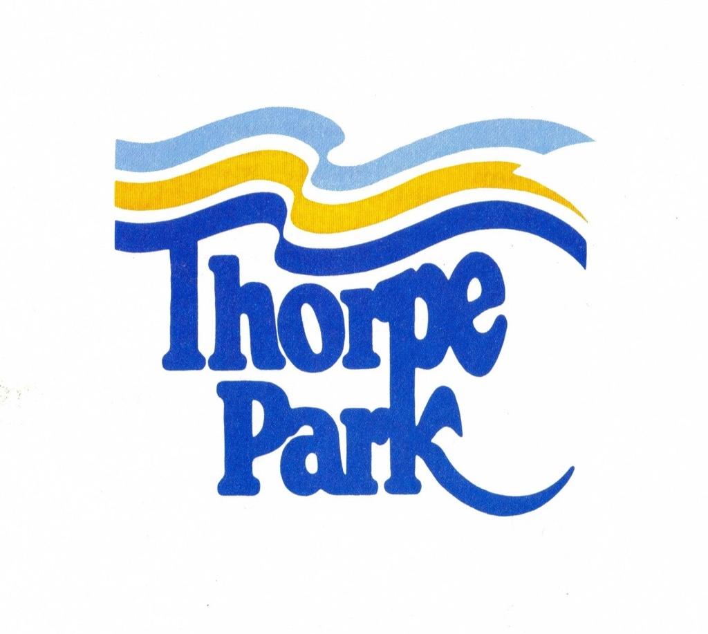
I won't lie, the more I see that OG logo, the more I grows on me. I noticed that Tussauds even kept the colour scheme of the OG logo when they introduced the infinity logo.Again Thorpes original logo is a great example of flat logo design![]()
Should have had this with the new colour palette and brand design language/ material![]()
The new one would've look so much better if they added a silhouette of the Dome above it in the background and made the fonts have the orange and blue colour the OG logo and the infinity logo had.
BarryZola
TS Member
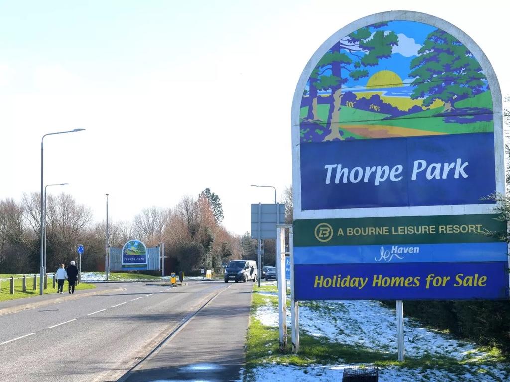
Even they wouldn't want it!Maybe whoever designed the new logo got mistaken and thought that they were designing one for the other Thorpe Park, the Haven holiday park in Cleethorpes. That new logo would fit right in there.
![]()
Steve74
TS Member
These are a couple of fan-made logos, I've not seen the videos where the park have explained their thought processes and reasoning for the re-brand but I understand they wanted to leave the infinity loop behind. That's fine, but look how much better the logo looks with something behind it!

(@A1daN02 on Twitter)

(@coaster_gen on Twitter)

(@A1daN02 on Twitter)

(@coaster_gen on Twitter)
Joel
TS Technical Admin
What they have created and released is nothing short of a wordmark rather than a logo - and theres a clear difference between the two, of which a wordmark and/or a logo then make up a brand mark.
The problem is amongst all of the other brand collateral (designs and patterns), it works well, and doesn't look out of place. And it even looks fun but retro at the same time when placed on those patterns.
But take it away from all of those other brand elements and stand it alone, particularly on a white webpage like their site where its also out of balance in terms of scale with the page (because they've clearly squished it down to dimensionally fit), and it looks truly awful.
I think even if it just had something more to make it more of a logo than a wordmark, it could have passed a little better.
(Oh, and I'm not bias, but as Ian says... the slanting 'o' is just lazy and looks so off! Why did they not match the heights so it didn't look uncomfortably out of place!)
Quetzal
TS Member
Appalling.
The wonky o is jarring and the logo seems compositionally off. To go from such a strong logo as the infinity to this lifeless wordart is a real shame. Why was there a need to change it in the first place?
With the way Thorpe is being run these days, and the standard of this logo, am I wrong to suggest that Silkstone and co have made this rather than a proper marketing agency?
Steve74
TS Member
It does make you wonder! Afterall, two of his mates do some music overlays and have filmed some promo videos. Don't get me wrong, fair play to them for doing it (especially if they have their own companies and were officially commissioned to do the work), but I dunno, using people who ultimately are just fans to do that kind of important work for a theme park this big and popular just doesn't sit right with me.Appalling.
The wonky o is jarring and the logo seems compositionally off. To go from such a strong logo as the infinity to this lifeless wordart is a real shame. Why was there a need to change it in the first place?
With the way Thorpe is being run these days, and the standard of this logo, am I wrong to suggest that Silkstone and co have made this rather than a proper marketing agency?
Dobba
TS Member
Thorpe Park ft Sonic and Tails.
Trooper Looper
TS Member
Sonic Spinball relocation to Thorpe Park when please?Thorpe Park ft Sonic and Tails.
Joel
TS Technical Admin
With the way Thorpe is being run these days, and the standard of this logo, am I wrong to suggest that Silkstone and co have made this rather than a proper marketing agency?
I find it incredibly difficult to believe that the powers that be at Merlin would even permit a division to run with their own in-house designed branding (or that of a individual) for the whole division - certainly I think some elements and stuff could have been done in house, but not a whole rebrand.
It would be far too risky, there is no other company to lay [financial] responsibility at the doorstep of if it does backfire, and I just don't think Merlin directors and management would trust someone in-house to have the expertise to take on a whole brand.
So despite the lack of direct evidence for now, I would say they have paid a brand agency for this - the problem is, working for one of those very agencies once upon a time, it doesn't matter how good the agency is, their research or their advice - the client is ultimately always right, and will ultimately have their way. The agency could have presented them with all these problems, but if their vision is too strong and they wouldn't back down, they are just going to do as they ask in the end to get it out of the door on budget.
That, or it was just a truly awful brief to the design agency, and they have been cheap on the tendering for it (AKA the good old "We've only got £35k for a new brand, make it happen in 12 weeks... now GO!")... that I can believe and have seen far too often....
Martin
TS Member
jon81uk
TS Member
Just realised, no ‘Resort’ ?
Yep I think Thorpe had already stopped withe the resort branding anyway? Given they have “accommodation” but not really a hotel or much else it made since not to push that they are a resort.They said in the video that they want to be known as a "theme park with onsite accommodation" instead of a "resort ".