• ℹ️ Heads up...

    This is a popular topic that is fast moving Guest - before posting, please ensure that you check out the first post in the topic for a quick reminder of guidelines, and importantly a summary of the known facts and information so far. Thanks.

Thorpe Park: General Discussion

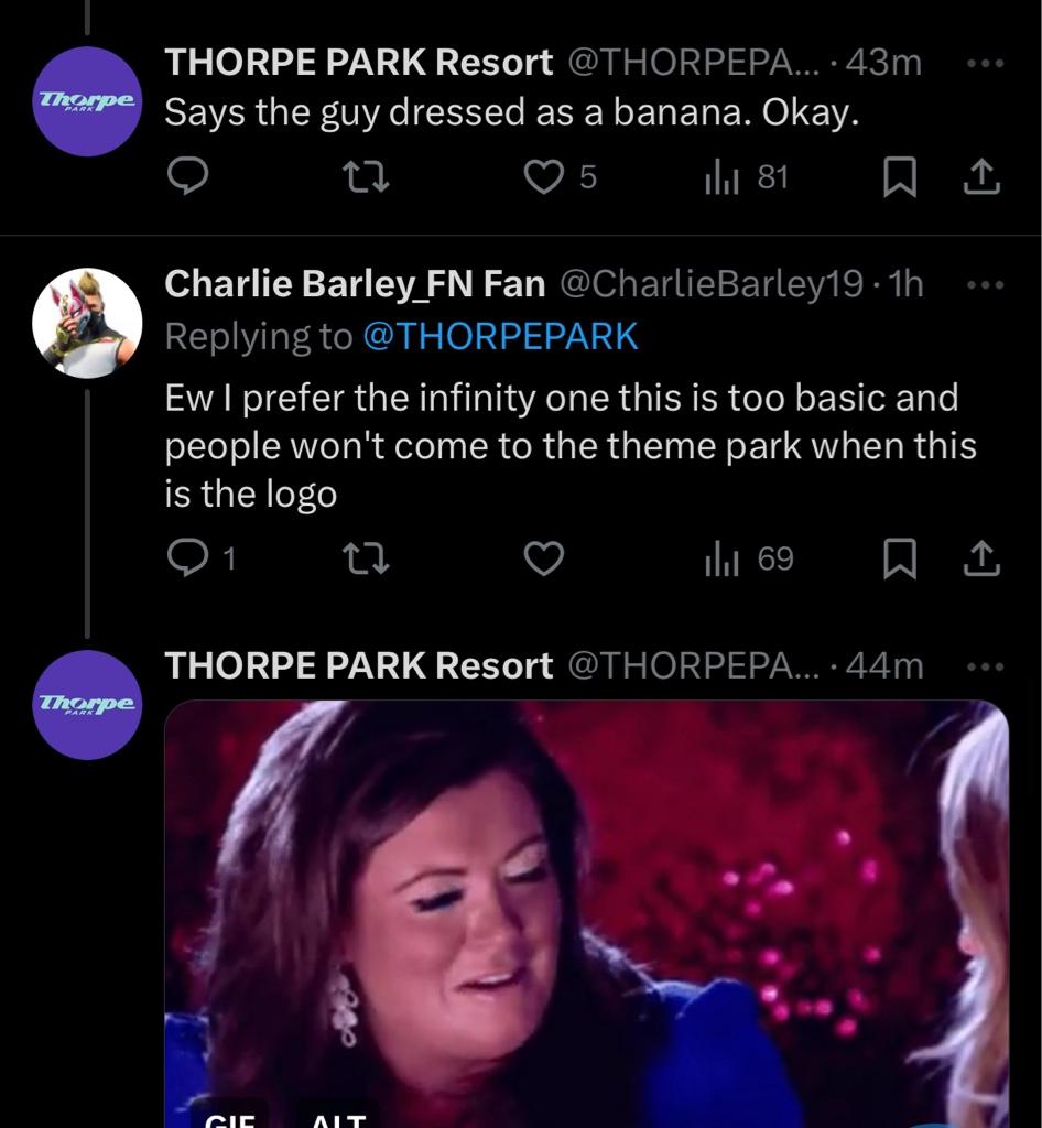
Right.. Thorpes social team have still not changed then and are just as unprofessional as before then …

af4c26375143c6e53eaa1d8539b114d7.jpg


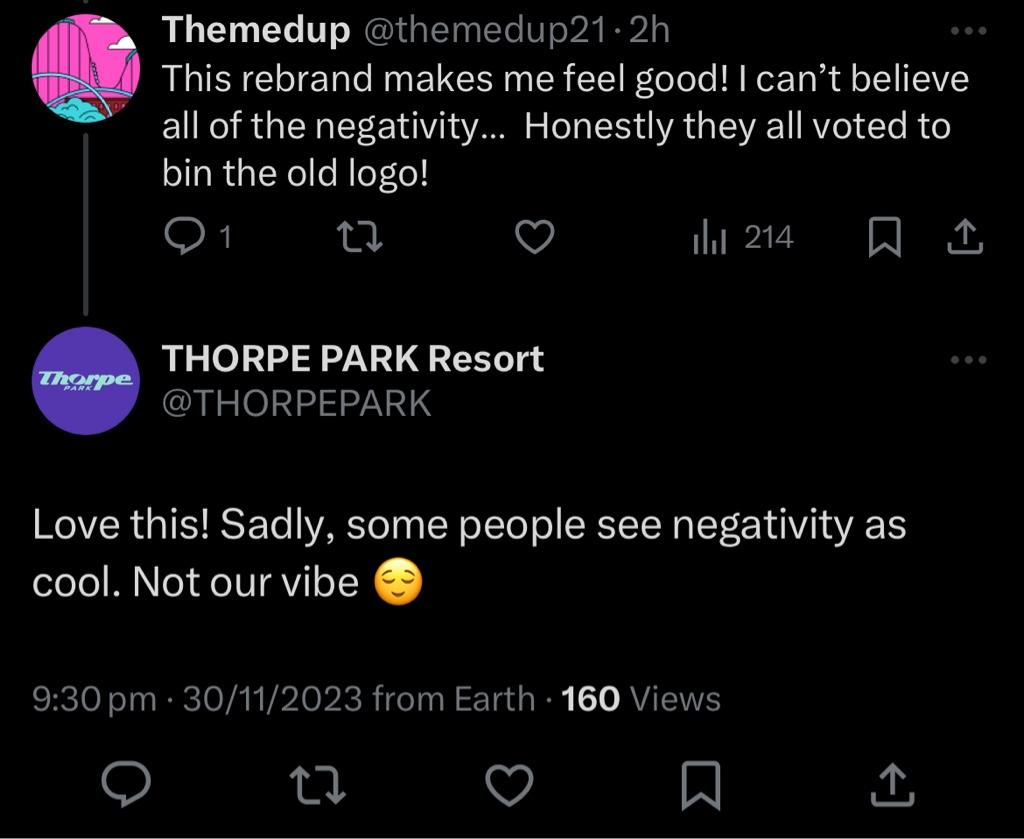
c80f970f77eb79e715f0ad3b4117f88e.jpg


‘Some people see negative as cool’ no Thorpe, they are just being honest, you literally said in your video that you want to listen to the public more.

You can’t even make out the logo in the profile picture
That's a very good point of the not being able to recognise the logo in the profile picture. The Infinity icon was so iconic that if you saw it from a distance, 99% of the time you'd probably immediately think of Thorpe Park, that's how iconic it was. Now the new one blends in with almost every logo you come across.

Change isn't bad, but it's how it's done that matters. Sometimes there are good changes that are genuine improvements over what was there before...
AltonTowers2021Logo.png

But most times...
20231130_195347.jpg
 
I am unsure right now, but I think I quite like it. What I can say though, is that I certainly do not hate it. Far from it.
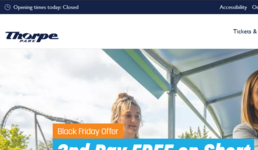
I think like many have said (including myself) stick it with the other branding - on posters with coloured swirls etc it looks ok. But on its own like in the post above or on their website:

1701383865137.png
it just looks plain, boring and too corporate. I mean even with that coaster in the background of that screenshot, you could be forgiven for thinking that was a website for something other than one of the top theme parks in the UK!
 
It doesn’t convey a new brand identity, it conveys no brand identity.

Having said that, I'm not adverse to the general wider branding, the colours and patterns. And I understand that a logo to sit on top of these has to be fairly plain or it would look a big old mess, so I get it has to be that way to an extent, but it is just beyond nothing as a logo. It conveys zero about what the park is and has an odd ugliness about it
 
Earlier at work this evening, during a quite point, the following exchange took place. Presented, without embellishment....

Me: (out loud, while browsing this very thread) What the actual, festering [censored]‽ This can’t be serious!
Workmate 1: What? What’s up?
Workmate 2: (Puts his phone down and turns to me in a “oh this’ll be good” way) Oh go on, what now?
Me: OK, hang on. (scrolls) OK, This has been Thorpe Park’s logo for the last couple of decades... (turns iPad towards them)
WM2: Oh yeah, I know it.
WM1: Yeah, we’ve been there loads of times with the kids.
WM2: Why, what have they done now?
Me: Well, all week they have been teasing some big announcement. Daily build up videos. The works. Their new brand logo is....... (scrolls down and shows them)

WM1: (Screws up her face as if looking at something that makes her feal ill) Urrrrgggghhhh! That’s horrible!
WM2: BWAHAHAHAHAHAHAHAHA! Are they taking the [censored]‽ (Proceeds to laugh so hard for the next ten seconds, that he throws his head back and narrowly eascapes braining himself on the door frame behind him)
 
Last edited:
So they have at least confirmed they were intending for the new “logo” to be a wordmark:


From: https://x.com/thorpepark/status/1730345515466760546?s=46&t=6Mljne77mVILyqvSsDVeRw


I feel like some agency has really sold them hard down the river to become a wordmark, especially trying awfully to compare themselves in that very Tweet to successful wordmarks.

Except Thorpe Park just does not have the same brand recognition like any of those companies - hell let alone in all of the UK, never mind the world - so it just wasn’t going to work either.

Alas, of course it will all blow over and people will just accept it and move on, and it doesn’t matter how much we complain or anyone else does, they won’t roll it back or change it suddenly as they are too far invested in it now.. aka the sunk cost fallacy.

However dismissing people’s opinions and even belittling or sarcastic retort is definitely not cool, especially when they claim to be listening to fans on one hand, and sarcastically dismissing opinion (and doubling down on it) with the other.

They, like any good business and design agency, know there will be critics, and people who just don’t like change, and it will blow over - but I don’t like the way they are handling that too, and yet again feels like they are trying to ride on someone else’s coattails of trying to be aLl EdGy SoCiAL mEdIA bANts… like Ryanair social media.


From: https://x.com/thorpepark/status/1730342174347125049?s=46&t=6Mljne77mVILyqvSsDVeRw


Accept your critics too and move on rather than belittle or retort to them, or stop claiming to be “listening to them”.

You knew this would happen after all… 🙄


From: https://x.com/thorpepark/status/1730336989101142498?s=46&t=6Mljne77mVILyqvSsDVeRw
 
Between Thorpe’s replies on social media, and that recent Amanda Thompson interview.... What is it with parks turning on their loyal fanbase lately?
I never thought I’d see the day.

Next thing you know, The Great John Wardley himself will tell us to “get a life”!
 
Last edited:
I'll be honest and say I'm quite the fan of the new logo. Though in some senses I can see people's distaste for it. Looking back at the old infinity logo I do feel that it has a slight tackiness to it and lacks the adaptability that the new logo possesses through its simplicity. With the new logo it does allow for for it to adapt more (colour changes, maybe bringing back old infinity design, applying new ride branding to it) much like how Alton change their logo with new ride releases. While I know that this could be done with the Infinity design I felt it could be a bit restrictive on how it could be done.

Another thing I will mention is that the logo is a lot better in motion, which unless you watched those last 20 seconds of the video where not much happens, you will have missed and opens up a large opportunities for merchandising as well. Link is here for those last 20 seconds).

People will always hate change especially after 15 odd years and I think people will warm to the new one once the initial discomfort has worn off. Looking forward to the future.
 
I'm not sure that this is people hating change, though.

Most of the narrative over the past few weeks have been people being extremely receptive to the idea that Thorpe Park were going to change their logo. Not least because I think most people recognised that the old logo was ready to be changed (a bit like Drayton in that regard, their old logo was notably dated as well).

The negativity is purely sitting around that it's somewhere between not a very good logo (mainly from people with a design background) and it's not a logo that represents Thorpe Park (or any theme park) very well.

I think Matt N summed it up pretty well a few pages back when he said it's "it’s nice, clean and classy." This is why people are comparing it to a business park logo - because a business park would want to be seen a nice, clean and classy. Thorpe Park is not, would not want to be, nor ever will be 'nice, clean and classy', so a logo that inspires this reaction is not what is needed. They needed a logo that matched up with "the home of feel-good thrills".
 
I just still can’t get my head around this being the new brand for the park, like it’s flat, bland and has no charm whatsoever.
Like coming form a design background, it’s just not suited to a theme park whatsoever.
And the main logo having multiple colour palettes makes it even harder to build a recognisable brand that people will remember.

The way Thorpe are acting on socials it just leaving a bad impression already, not exactly a good fresh start being passive aggressive to for the most part honestly feedback

they are either gonna double down on this or have to take feedback on board and do something about it.
 
I was never precious about the existing Thorpe Park logo. I didn't like the bubble writing and found the infinity symbol didn't have any strong meaning to me personally, so I was initially excited for the rebrand.

The new logo, branding and 'core values' presented in the video are utterly uninspiring to me.

Their movement towards minimalism, and to quote the video; 'simplicity, no frills, no gimmicks, no sugar coating, what you see is what you get' is the complete opposite of what I look for a theme park. For me I want a theme park to contain layers of meaning, mystery, unique storytelling, absurdity and rich themes. 'We're a theme park who happens to have onsite accommodation'... I couldn't believe that line made it into a video promoting their new brand direction, how underwhelming it makes the park sound!

Last time I visited, It felt more amusement park than theme park which is a real shame. I see this being reinforced with the new branding.
 
Top