• ℹ️ Heads up...

    This is a popular topic that is fast moving Guest - before posting, please ensure that you check out the first post in the topic for a quick reminder of guidelines, and importantly a summary of the known facts and information so far. Thanks.

Thorpe Park: General Discussion

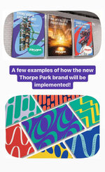
The park has deep-rooted issues and for the past decade, they've limped on by doing a light rebrand every few years (coincidentally, probably when a new marketing lead comes in). We've had "Nation's Thrill Capital", then "Island Like No Other", more recently the Infinity stuff, and now this homogenised, local-radio station aesthetic. It's all well and good slapping a new logo on something and claiming the park is headed for a new era, but actions really do speak louder than words. Yes, we're getting Hyperia - a good start, but adding a new ride is just the first fix to many issues. There's also overcrowding and Fastrack sales, cleanliness, ride upkeep, consistently good events etc. that need fixing as well if this truly is the start of a new chapter. Not to mention ironing out any internal kinks and staff politics that we don't know about.

It's a bold claim to shout from the rooftops that this is a "New Thorpe Park", but we won't actually know if it is that, or just another wolf in sheeps clothing situation, for a few years yet. An infinite loop will keep on repeating, even if they're now pretending to be something else.
 
Last edited:
I’ve noticed that a few people don’t like the new brand presented by Thorpe Park because they think it implies that the park is moving towards more of an amusement park type feel.

If you don’t mind me asking; out of interest, what it is that people don’t like about Thorpe becoming more of an amusement park and adopting more of a minimalist feel?

Plenty of parks have made a success out of not really doing theming and just focusing on no-frills thrills, and I’d argue that there is space for a park like this within the UK market that Thorpe Park could fill very nicely. I think the minimalist amusement park type approach that mainly focuses on thrills over theming differentiates them nicely from the other parks in the area, personally.
 
I think theyre trying to be playful in the same manner Ryanair do, but it works for Ryanair as they are just riffing off their terrible reputation.

It doesnt really work well for a theme park that is trying to rebrand to be a bit more friendly, though…


Sent from my iPhone using Tapatalk Pro
 
I don't like the logo. But I do get it.

Thorpe is clearly trying to go for the Teen/ thrill seeker market. The old logo (which I liked) was clearly aimed at a family/ younger demographic. The new logo has a bit more maturity to it, it is stylish in a more modern way. It will be easier to shift merch to teenagers and young adults with the new logo on it too.

Again, personally, I don't like it but I get why they have made that choice.

On a side note, it is good to see Merlin going down a route with definitive core demographics for their parks - Chessington for younger families, Thorpe for Teens/ young adults and Towers being the all-round family resort. It will be interesting to see how this pans out for future Towers attractions.
 
I think theyre trying to be playful in the same manner Ryanair do, but it works for Ryanair as they are just riffing off their terrible reputation.

It doesnt really work well for a theme park that is trying to rebrand to be a bit more friendly, though…


Sent from my iPhone using Tapatalk Pro

The person who designed the logo is apparently the same person managing their social media, so I'm not sure it's an attempt to be playful or if they've taken offense to the criticism and are genuinely posting stuff in anger that they shouldn't be.
 
I’ve noticed that a few people don’t like the new brand presented by Thorpe Park because they think it implies that the park is moving towards more of an amusement park type feel.

If you don’t mind me asking; out of interest, what it is that people don’t like about Thorpe becoming more of an amusement park and adopting more of a minimalist feel?

Plenty of parks have made a success out of not really doing theming and just focusing on no-frills thrills, and I’d argue that there is space for a park like this within the UK market that Thorpe Park could fill very nicely. I think the minimalist amusement park type approach that mainly focuses on thrills over theming differentiates them nicely from the other parks in the area, personally.
I don't like the new logo because I think it's just boring, generic and bland. The marketing strategy for it is a self imposed disaster (for now anyway, all this will settle down and be forgotten about soon, it just baffles me as to why they saw fit to bring this on themselves).

But I agree with you that it's probably a good idea in principle for Thorpe to embrace what they are. I don't understand why they've pulled their pants down and taken a dump over their recent past, when as far as I can see they're actually embracing it and this logo change strikes me more as striving to achieve coherency and putting the branding identity crisis days behind them.

They are an amusement park full of thrill seeking people (and hoodlums) and not a family resort. That's the reality, and despite Brake Run: The Ride looking more bright and classy, it doesn't look like they plan on moving away from this anytime soon. Whilst I disagree with this strategy personally, there are certain reality acceptance undertones here.
 
Are we definitely sure this isn’t some elaborate wind up?

From a company that pretty much always nails the marketing even when they get everything else wrong? It’s so odd.

It'd make very little sense from a PR perspective - there being a "ha, fooled you" element would look absolutely terrible and really damage their already fractured image.
 
Thorpe is clearly trying to go for the Teen/ thrill seeker market. The old logo (which I liked) was clearly aimed at a family/ younger demographic. The new logo has a bit more maturity to it, it is stylish in a more modern way. It will be easier to shift merch to teenagers and young adults with the new logo on it too.
Looks nearly identical to Drayton manor and their demographic is families
 
Are we definitely sure this isn’t some elaborate wind up?

From a company that pretty much always nails the marketing even when they get everything else wrong? It’s so odd.
Not so much a wind up, but I do think it’s been done intentionally to drive up social media engagement in general and get people talking about the rebranding and sharing it. Surely they predicted people would react negatively to it?
 
The more I see it the more I think it looks decent.

Unpopular opinion I grant you but I quite like it, then again I’m about as artistic as a drunken bat so my vote is perhaps not what they were aiming for.
 
Are we definitely sure this isn’t some elaborate wind up?

From a company that pretty much always nails the marketing even when they get everything else wrong? It’s so odd.
I doubt it is a wind up, but it would be amazing if it was, although I like the logo more than most.
 
It’s just way to basic.. Merlin love doing 241 tickets on products and there is no way that logo will stand out whatsoever.

They way they are reacting on socials is just leaving a bad taste in everyone’s mouth, like are we not aloud an opinion
 
It’s just way to basic.. Merlin love doing 241 tickets on products and there is no way that logo will stand out whatsoever.

They way they are reacting on socials is just leaving a bad taste in everyone’s mouth, like are we not aloud an opinion
The problem with opinions is that everybody's got them and they never seem to match up. Not too long ago I was voicing an opinion that having a New Orleans themed area with Tidal Wave adjacent might be considered in poor taste and a little misjudged. I was told, on this very thread, that I needed to "question" myself, and received a bunch of sarcastic retorts dismissing something that I thought required just a little more thought. I must say, at that point in time, I did feel as though I wasn't allowed an opinion which differed from the crowd.

I wasn't the only person to suggest such a thing, however, as others pointed it out the connection I'd made on socials. They also got sarcastic witty engagement retorts from Thorpe.

I guess I'm saying it cuts both ways. Thorpe's current strategy is to mock any criticism they receive, regardless of the intention behind it. Yes they're a big brand, but as enthusiasts, we're not that much better sometimes.

To be fair, the only person that I have season on the receiving end of a sarcastic witty retort made a rude comment and included within it some weird insinuation that the male on the videos was somehow making the female person uncomfortable, if you post that sort of stuff then its reasonable to receive something slightly less than polite in response, which, to be fair, was only pointing out that his profile photo was one of him wearing a banana.

If you don't like something there's ways of making that point without coming across as rude, I'd be surprised if Thorpe's social media team have made any similar responses to anyone expressing a genuine opinion.
 
Are you even going to be able to read it once it’s been shrunk down and put on cereal boxes and soap bottles? You already can’t read the “PARK” on their social media profile pics.

The font is off a free front website
Thanks for the link pal. I've got things to do and I can't stop messing around with it now.1000001458.png1000001459.png1000001457.png
1000001460.png
 
Top