- News all the latest
- Theme Park explore the park
- Resort tour the resort
- Future looking forward
- History looking back
- Community and meetups
-
ℹ️ Heads up...
This is a popular topic that is fast moving Guest - before posting, please ensure that you check out the first post in the topic for a quick reminder of guidelines, and importantly a summary of the known facts and information so far. Thanks. - Thread starter Ted
- Start date
- Status
- This topic has been locked. No further replies can be posted.
- Favourite Ride
- Steel Vengeance
- Favourite Ride
- Pirates of the Caribbean - Paris
- Favourite Ride
- Iron Gwazi
- Favourite Ride
- Space Station Mir
- Status
- This topic has been locked. No further replies can be posted.

You are using an out of date browser. It may not display this or other websites correctly.
You should upgrade or use an alternative browser.
You should upgrade or use an alternative browser.
Thorpe Park: General Discussion

Rob
TS Team
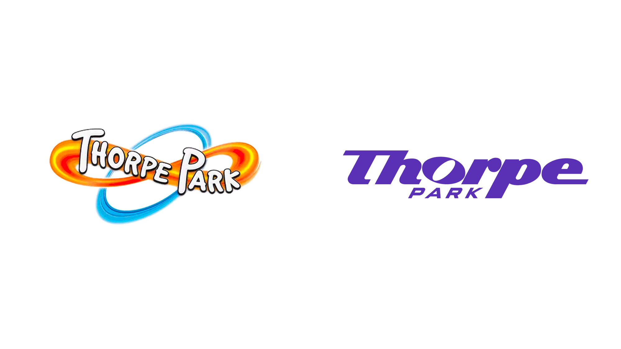
To be quite perfectly honest, the two previous logos posted look just as amateur as they are. I still think that what Thorpe Park probably should have done is have taken their well established and very recognisable infinity logo and re-worked it to bring it to a more modern standard that fits in with their new brand direction.
evilcod
TS Member
Goodness knows what all the young mums who got Thorpe Park's infinity logo tattooed on their wrists are going to do now, cover up time I guess?
I actually really like the branding as a whole, the logo was too plain for a big reveal though, they should have done a branding reveal with the logo just in there.
(plus finish the logo by fixing font heights etc)
I actually really like the branding as a whole, the logo was too plain for a big reveal though, they should have done a branding reveal with the logo just in there.
(plus finish the logo by fixing font heights etc)
Ye but those logos were done quickly and with little effort. Just proves the point that Thorpe spent no time on the logo. Clearly ran out of budget for the actual logo spending money on the other guy to do background designs. No idea why Thorpe have gone down this route in the first place. They didn't need to rebrand it was unnecessary. They've changed it from something recognisable to something bland and genericTo be quite perfectly honest, the two previous logos posted look just as amateur as they are.
Last edited:
Johnny Rocket
TS Member
Tis I, the rule breaker! Summary from a (paywalled) re-branding blog who have picked up on the new logo/rebrand
- they’ve summarised what Thorpe Park is, its history, images from the rebrand and the 3 part YouTube series, and lifted quotes from Thorpe Park on why they’ve re-branded
- said the old logo was terrible but also great in that it didn’t try too hard and no question it was for a fun theme park
- new logo is unfortunately also terrible but it’s now trying too hard to be good. Hard to tell what vibe they’re going for
- poor execution with note to the baffling ‘O’ - essentially say the technical elements of the construction of the logo are poor - call it an “abomination”
- patterns are awkward and show a different aesthetic to everything else they have going on
- overall a very sad missed opportunity as it’s rare a theme park gets a full rebrand and the park has a rich history to pull from
The reader comments are very negative, with some noting the poor application on the website. Overall consensus is that it doesn’t represent anything fun and doesn’t look like a theme park. It has been likened to a logo for a pharmaceutical company or car hire firm.
Note that these are not opinions from theme park enthusiasts, this is a well established branding blog.
There are also comments on their Instagram post:
From: https://www.instagram.com/p/C0eeMZguDLf/?igshid=N2ViNmM2MDRjNw==
- they’ve summarised what Thorpe Park is, its history, images from the rebrand and the 3 part YouTube series, and lifted quotes from Thorpe Park on why they’ve re-branded
- said the old logo was terrible but also great in that it didn’t try too hard and no question it was for a fun theme park
- new logo is unfortunately also terrible but it’s now trying too hard to be good. Hard to tell what vibe they’re going for
- poor execution with note to the baffling ‘O’ - essentially say the technical elements of the construction of the logo are poor - call it an “abomination”
- patterns are awkward and show a different aesthetic to everything else they have going on
- overall a very sad missed opportunity as it’s rare a theme park gets a full rebrand and the park has a rich history to pull from
The reader comments are very negative, with some noting the poor application on the website. Overall consensus is that it doesn’t represent anything fun and doesn’t look like a theme park. It has been likened to a logo for a pharmaceutical company or car hire firm.
Note that these are not opinions from theme park enthusiasts, this is a well established branding blog.

There are also comments on their Instagram post:
From: https://www.instagram.com/p/C0eeMZguDLf/?igshid=N2ViNmM2MDRjNw==
Joeythorpe
TS Member
It’s been a few days and still haven’t warmed to the new brand one bit. It still feels rather too bland and basic, and not recognisable at all, kinda just blends in with what everyone else is doing in design/branding atm.
The branding needs to have depth and not be flat. Also there being such contrasting colours text can be hard to read being dyslexic as I found in the wrapped video I have just watched
The branding needs to have depth and not be flat. Also there being such contrasting colours text can be hard to read being dyslexic as I found in the wrapped video I have just watched

George W
TS Member
I wouldn't be so mythed if the new logo was actually a well thought out streamlined and modernized logo which held together a cohesive brand identity but it's just a font that looks ****, no more signature color to help recognition either because there's like 7 colors they're gonna use and loads of different ugly corporate looking patterns.If I was paying a marketing company thousands of pounds to design a new logo, I'd at least expect a unique font of some sort.
Admittedly I got used to Drayton manors new logo pretty and was fine with it when I saw it in person but honestly I think Drayton manors logo is far better in comparison honestly.
Islander
TS Member
I mean to be fair, we're nearly a year beyond Varney's departure - any focus that he, and thus the business had, will not necessarily have remained.For a company that is allegedly “marketing” led, based on Nick Varney…
It amazes me the tens of people who signed off on this, can only assume they’ve not followed their own advice
I mean to be fair, we're nearly a year beyond Varney's departure - any focus that he, and thus the business had, will not necessarily have remained.
The recent talk by head of marketing? (Apologies can’t remember the name) to AS suggests otherwise.
Marketing are deciding themes and rides
Explains a lot
Jesus that is awful! Glad you didn't do the rebrand !They should have jut simplified the logo they had or just keep the text.
There arn't many cases of companies completely changing it to the extent where it looks completely different:
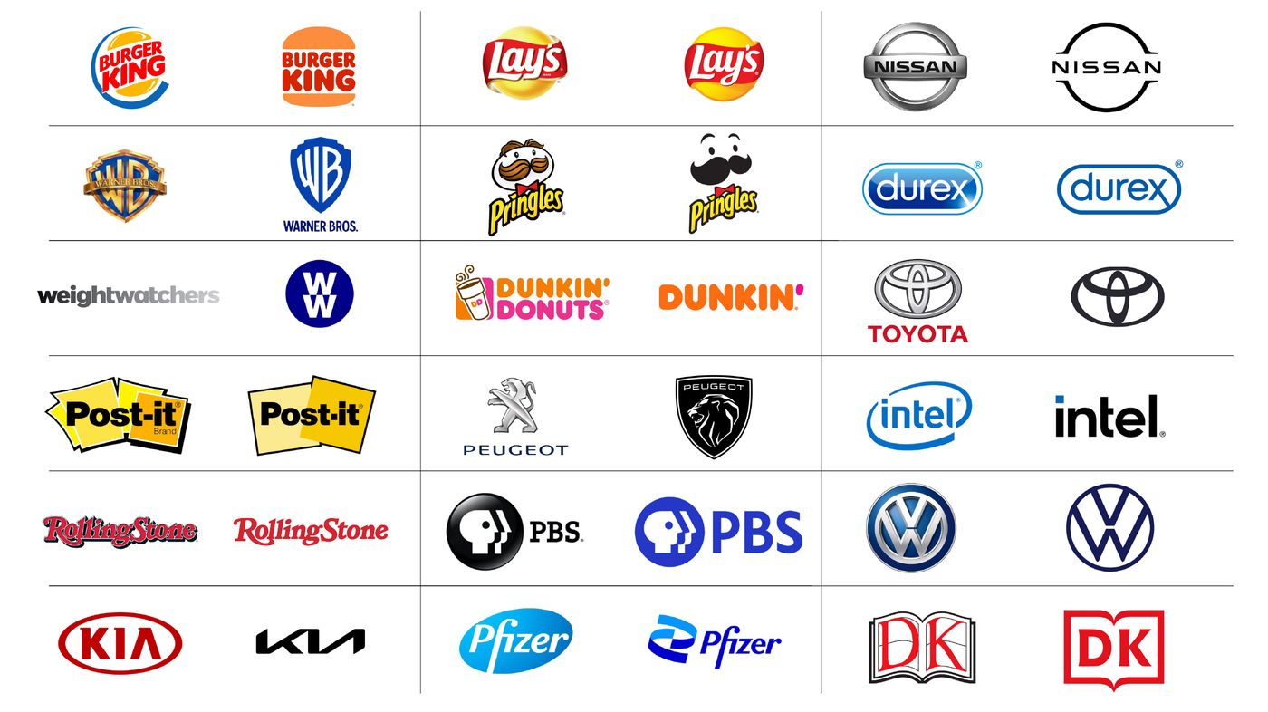
Something similar to below would've been a better evolution of the logo IMO.

Craig
TS Administrator
I know the rebrand stuff is now across multiple pages, but just a few things to ensure future discussion is constructive:
Thanks in advance")
Critique the rebrand, but not individuals involved
If you don't like the rebrand, that's fine. But there's been a number of occasions where individuals have been singled out as being "at fault" when that's not the case - and for me and probably others I'm not comfortable with that being the case. Regardless of if an individual redesigned the logo or not, Thorpe Park as a company made the decision to OK the design. The buck ultimately stops with them, and pointing fingers at individuals does absolutely nothing to add to discussion here. A reminder of our Member Expectations for respecting the wider community:Just like our own members, we think other communities out there and their members should be treated how you’d like to be treated by them in return – courteously and respectfully. After all, we all share the same passion of loving theme parks and rides, we just all have a different way of showing it.
And that’s why we ask you to remain respectful and courteous towards other communities whilst on our forums, across our social media, or even on meet ups. Of course we know there will be discussion and perhaps even praise or criticism for others thoughts, ideas and ways – but we ask you to remain respectful and rational, otherwise you may see your posting rights affected again… and we really dislike doing that too, as it happens.
Just remember – treat people how you’d like to be treated, and you (hopefully!) shouldn’t go wrong!
Add to discussion
There's been some great posts in this topic, but equally there's a lot of "ranty" posts where people have simply said they don't like the logo. But let's add a bit more to further discussion. Why don't you like it? What would you do differently? I think the 100's of posts have established the logo isn't well received by most, so please add something further.Respect other members
We've had a number of posts in response to others who have too the time to create alternative logos/changes which to be blunt, have been bordering on quite rude. If you don't like a suggestion/design from a member, that's fine - but please sensibly and politely critique it in response. Rather than simply say you don't like it, expand on what you don't like, and maybe suggest what you would do differently. Again, as our Member Expectations point out, treat others how you'd like to be treated:Please treat others how you wish to be treated. Everyone is entitled to an opinion, and although things can get heated, avoid getting into direct arguments with others and ensure you contribute in a mature and sensible manner. If your behaviour is brought to the team’s attention, we might need to contact you to discuss further and/or edit or remove the problem posts. Repeat offenders may risk changes being made to their posting rights – and we wouldn’t want to do that!
Thanks in advance
MaxPower
TS Member
I knew I should have used comic sans and Microsoft paint....Jesus that is awful! Glad you didn't do the rebrand !
jon81uk
TS Member
Although the worst part of the old logo was the text, the bubble font in all-caps didn’t look great even with the infinity and loop behind.They should have jut simplified the logo they had or just keep the text.
Johnny Rocket
TS Member
Unfortunately (or not?) I can’t see this lasting more than 4-5 years. It hasn’t been well received and its success is now relying on people “getting used to it” which isn’t exactly a great start. It should have been something that people found appealing from the beginning.
I think a modernised version of the original 1980s logo would have gone down well. It’s very on trend for brands to revert back to modernised older logos for that nostalgia appeal. And it would have fitted with the retro vibe they’ve obviously tried to do.
I think a modernised version of the original 1980s logo would have gone down well. It’s very on trend for brands to revert back to modernised older logos for that nostalgia appeal. And it would have fitted with the retro vibe they’ve obviously tried to do.
pluk
TS Member
Surely the way to have gone would have been the new text (Or sOmething like it with a better fOnt) with an actual logo to sit upon (be that an infinity variantor otherwise), which could also be used as stand alone text without the logo on other media? I think the whole issue is really that the text is veing presented and used entirely in isolation.