Dave
TS Founding Member
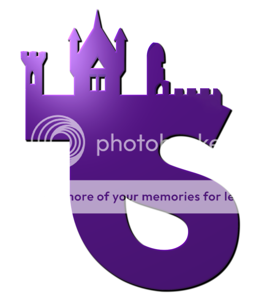
Ryan said:Gone for something pretty simple - it's the main tower of the towers flanked with a take on the three flags in the towers logo. What does everyone think?

On this one, the 'flags' are only on one side, giving the idea of progression...moving on...

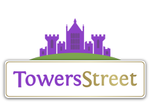
Here is a another version with the full towers in gradient purple and blue

And the last one, the towers in purple and blue and the name now has a shared gradient 'S'

And to give an idea of the logo at it's smallest

It would be really helpful if you guys could tell me which one to develop -
1) Single tower and 'wing' flags
2) Single tower and single set of flags
3) Full towers
Also, which font? -
1) The TS fontastique font
2) The other one (bog-standard segoe ui)
3) Something else altogether
How about stars as well as or instead of flags? Could work maybe.
Liking all these logos though guys
