• ℹ️ Heads up...

    This is a popular topic that is fast moving Guest - before posting, please ensure that you check out the first post in the topic for a quick reminder of guidelines, and importantly a summary of the known facts and information so far. Thanks.

TowersStreet - Make Your Mark

Here's one of my idea's for the logo! :D

aw3rky.png
 
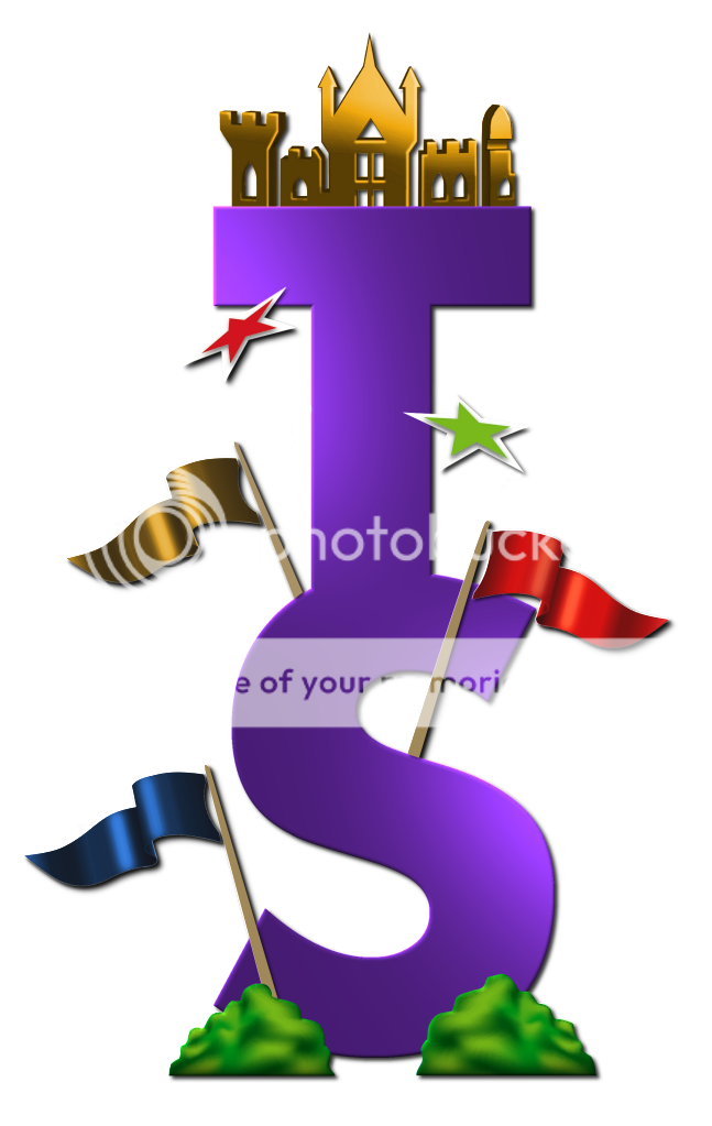
Heres my first attempt i assumed nobody was posting there logo's until the four were posted for voting, but as others are, here is my first attempt :) hope you guys like it. i will send it to the submissions email tomorrow.
TSLogo3-1.png
 
Brett said:
Heres my first attempt i assumed nobody was posting there logo's until the four were posted for voting, but as others are, here is my first attempt :) hope you guys like it. i will send it to the submissions email tomorrow.

TSLogo3-1.png

Remove the "S" and write "Street" inside the top part of the "T"
As in the long part...
In my opinion.
The gold towers and the flags are awesome though.
 
Oli said:
Remove the "S" and write "Street" inside the top part of the "T"
As in the long part...
In my opinion.
The gold towers and the flags are awesome though.

I am going to do a few variations on the logo so that can be one i may look at thanks :)
 
The Psychoaster said:
I think it would look good with 'Towers' above the TS and 'Street' below it - in a font size which fills the width of the TS logo. Only my humble opinion though.
Well I gave it a go! I'm personally not sure it works so well as having all the text below, but it's an option:

TowersStreetsquare.jpg


Here it is with no text below at all :)

TowersStreetnotext.jpg


And a variant for each section of the site:

TSvariants.jpg


*now to go and submit them all! ;D*
 
Hi...

My logo I'm working on...

Gonna refine and obviously use vectors to add smoothness! :)

JUST A ROUGH SKETCH! I will probably start again on the final and use this as a template.


263c1d515eb4496684f5e0f.png
 
Kelpie said:
The Psychoaster said:
I think it would look good with 'Towers' above the TS and 'Street' below it - in a font size which fills the width of the TS logo. Only my humble opinion though.
Well I gave it a go! I'm personally not sure it works so well as having all the text below, but it's an option:

TowersStreetsquare.jpg


Here it is with no text below at all :)

TowersStreetnotext.jpg


And a variant for each section of the site:

TSvariants.jpg


*now to go and submit them all! ;D*

That's a really good piece of work I reckon. I like a lot about this.
 
I'm glad you've posted a rough sketch Fredward because I was going to try a very similar design but now I know to do something different. The rough sketch looks good BTW.

Your design’s looking good Kelpie. It looks simplistic which I always find works well with Logo's.

Brett, Just to warn you that your Logo doesn't fit on my Laptop screen because it's so tall. For future modifications you might want to not stack everything on top of the object before.

BigAl I love your Neon Logo although it's probably not something that could be used everywhere.

And lastly in response to Meat Pie: Yes I meant like that but you’re right that scale is a bit too small.

I hope that was all constructive feedback :)
 
Sorry for accidently stealing your idea nightfall! Feel free to draw it anyway, could look a lot better then mine lol!
 
Well aren't you lot a talented bunch?!! I had a play on PaintShopPro last night but I won't be submitting anything - you're all too good!! Reckon I'll stick to avs, sigs and wallpapers :p.

Good work guys :).
 
Kelpie said:
The Psychoaster said:
I think it would look good with 'Towers' above the TS and 'Street' below it - in a font size which fills the width of the TS logo. Only my humble opinion though.
Well I gave it a go! I'm personally not sure it works so well as having all the text below, but it's an option:

TowersStreetsquare.jpg

Definitely my favourite logo on here so far, the text definitely works better on top/below - it balances it out. I also love the little section logos, think they could work perfectly!
 
In fact, I've just had an idea. If you could slightly barrel distort the logo in PS so that the text and TS appear to be stretched around the background spotlight then I think it would look even better. :)
 
The outline of the towers that other people are using is that actually available anywhere or are you just drawing it yourself?
 
There are some amazing works here. I am very impressed. Now to design mine...it will be rubbish compared to these though, I'll give it a go though.
 
Top