- News all the latest
- Theme Park explore the park
- Resort tour the resort
- Future looking forward
- History looking back
- Community and meetups
-
ℹ️ Heads up...
This is a popular topic that is fast moving Guest - before posting, please ensure that you check out the first post in the topic for a quick reminder of guidelines, and importantly a summary of the known facts and information so far. Thanks. - Thread starter Matty
- Start date
- Favourite Ride
- Voltron Nevera
- Favourite Ride
- Pirate Adventure
- Favourite Ride
- POTC Disneyland Paris
- Favourite Ride
- POTC Disneyland Paris
- Favourite Ride
- Pirate Adventure
- Favourite Ride
- Pirate Adventure
- Favourite Ride
- Pirate Adventure
You are using an out of date browser. It may not display this or other websites correctly.
You should upgrade or use an alternative browser.
You should upgrade or use an alternative browser.
Drayton Manor Park
Skyscraper
TS Member
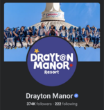
Question is, which looks worse; this or LVW's?Admittedly it does look better on the website than it does posted here in isolation but still not sure I am a fan at all. Very basic and kiddified.
Trooper Looper
TS Member
What the heck is that thing!?We appear to have a rebrand.

DistortAMG
TS Member
The trend of making logos more basic seems to have hit Drayton. This is a trend hitting brands all over the world. Pringles and Uncle Ben's are some of the latest to get this.
Not sure on it yet. The dislike could be coming from the fact that change is sometimes perceived as negative.
I will give it a few weeks, get used to it and let it bed in before I decide. I do not think it is that bad though. It is quite fun and clever, I do sort of like it. This will certainly appeal to the younger audience more, which I assume is what they were aiming for. I do not think it is as bad as everyone is making out though. Maybe it will bed in over time, change can be a shock at first. They could maybe tweak the colours a bit though.
I will run it over with my 7 year old and report back what he says. I am sure his views will be more positive.
Last edited:
Admittedly it does look better on the website than it does posted here in isolation but still not sure I am a fan at all. Very basic and kiddified.
I think it's clear they're rebranding with a specific direction towards younger children; the cartoony visuals of Adventure Cove and now the Viking area implies as much. A total rebrand is a natural next step.
It's about time they changed the logo, although as said, very basic and doesn't exactly pop out or scream family fun. I'd love to know what the brief was for this. Could they have not given it a bit more colour? Had the Resort part stand out on its own?
It will probably take years for this new logo to replace the old one at the park. There are hundreds of posters, signs, banners etc dotted around the park with the current logo on. Heck, the logo they had before the current one can still be seen around the park in some places.
DistortAMG
TS Member
It will probably take years for this new logo to replace the old one at the park. There are hundreds of posters, signs, banners etc dotted around the park with the current logo on. Heck, the logo they had before the current one can still be seen around the park in some places.
There is one of the older ones on the side of the Teashop I noticed the other week.
I agree, but I would assume all the main ones would be done by next season at the latest. Stuff like the main gates, maps ect.
Trooper Looper
TS Member
Honestly, I could wrap up a better logo then that on Adobe Illustratior in less than 4 hours.
WK4
TS Member
Lets see it!Honestly, I could wrap up a better logo then that on Adobe Illustratior in less than 4 hours.
The new logo looks alright on the website but not really very good in isolation. Is it just me who thinks it looks like a toys R' Us logo? I don't think it's dreadful but I think they could've done better. Drayton definitely needed a rebrand but I think doing it mid session is a bit strange.
Trooper Looper
TS Member
Don't have Adobe sorry :/Lets see it!
And given the fact that I don't feel motivated XD
AT86
TS Member
The new logo looks alright on the website but not really very good in isolation. Is it just me who thinks it looks like a toys R' Us logo? I don't think it's dreadful but I think they could've done better. Drayton definitely needed a rebrand but I think doing it mid session is a bit strange.
The first thing that came to my mind was it looked like a logo for a toy brand of some sort, yes.
jon81uk
TS Member
Off topic but Uncle Ben's didn't change logo, that is still the same, the brand name has changed to Ben's Original and they removed the picture of Frank Brown. The blue text on orange background remains, just now reads Ben's Original.This is a trend hitting brands all over the world. Pringles and Uncle Ben's are some of the latest to get this.
Bert2theSpark
TS Member
Trooper Looper
TS Member
Hey Drayton, we found your new Marketing Designer!
Rebrands can be the desperate actions of a business that's trying to get some attention when they haven't got anything new to offer. Or a new marketing director who wants to make their mark. In this case though, Drayton Manor has turned a real corner. I can certainly understand them wanting to draw attention to the changes.


