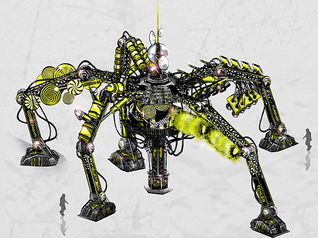
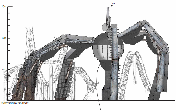
The more I look at the spider, the more I see it's inappropriateness and ill-design. It has all the aesthic qualities of some cheap sci-fi megadrive game, rather than the tense but subtle meanace of the original plans. It's now garish, over-the-top and for all of its many elements, it lacks any believable character. Big shame if it does turn out like this as it looked like a very promising bit of themeing, rather than this awful cartoony mess.
- News all the latest
- Theme Park explore the park
- Resort tour the resort
- Future looking forward
- History looking back
- Community and meetups
-
ℹ️ Heads up...
This is a popular topic that is fast moving Guest - before posting, please ensure that you check out the first post in the topic for a quick reminder of guidelines, and importantly a summary of the known facts and information so far. Thanks. - Thread starter Wilsy
- Start date
- Status
- This topic has been locked. No further replies can be posted.
- Favourite Ride
- Nemesis
- Favourite Ride
- Dizz, Bobby’s Yarn Land

- Favourite Ride
- Nemesis
- Status
- This topic has been locked. No further replies can be posted.
You are using an out of date browser. It may not display this or other websites correctly.
You should upgrade or use an alternative browser.
You should upgrade or use an alternative browser.
[The Smiler] Construction Updates and Ride Speculation
IanB
TS Member
Would be fun if the queue was a little interactive, and you could press buttons to make the different elements activate.
My worry is that if its not cleaned regular, and not maintained well, it will start to get that dirty layer, and bits will stop working.
Still, its a very intimidating looking device, and is certainly an attempt to use a large piece of themeing so it should be exciting to see this getting built. I think X-Sector could be a very busy area of the park, well before May.
Ian
CoasterCrazyChris said:I think now it is glaringly obvious that they are trying to make the spider element fit in with the theme they have created...the theming plans changed radically during the project but they were committed to the spider due to its size and interaction with the coaster and therefore its high importance in the project. So instead they were forced to alter it by adding these gimmicky marmalisation to the legs.

I completely disagree. I think it is now glaringly obvious that they submitted generic plans so not to show anyone what they were trying to do until the last possible moment. Lets not forget if it werent for site delays this would be opening in 3 weeks time so marketing will now be going into full swing.
I guess you will either love it or hate it judging by the boards reaction
rightbackgranty
TS Member
Mixed bag from that concept art in my opinion - as a whole it looks great; imposing, striking and making an effort at a central rollercoaster themeing item similar in scale to the nemesis monster. I like the oversized needles, the strobe lights and the possible use of steam jets on the sides of the legs - no, they're not scary, but they're at least in keeping with the general theme of the ride and I feel will enhance the experience (even if it just during queuing). Add that to the screen in the centre and its overall size then this really is a big effort on something that we didn't, for example, see with RITA.
However, I absolutely detest the "tickler" and "hypnotiser" elements. Its almost like they needed 5 good ideas, got 3 good ones and couldn't think of anything else. I fail to see how you will not be distracted by spinning disks on stationary themeing as you hurtle past them, particularly as you have other things to distract you (for example one of 13/14 inversions). The oversized needles work in the same way that the "head chopping" elements did before they were apparently cut from the ride, but a soft brush is hardly going to fill me with fear if I fly towards it.
It does suffer a little as they have recycled the idea from the previous theme that we saw in the planning documents. Whilst the SAW-esque theme was one that the community didn't really find exciting, the large spider element did fit in. They have been left with a large item that needed to fit in with a psychiatric theme - some of which works, some of which doesn't.
All round good effort though. Bit of refinement needed if we lived in a perfect world, but not bad! If it proves that they are taking the project seriously then I am all for it.
Dave
TS Founding Member
Meat Pie said:The more I look at the spider, the more I see it's inappropriateness and ill-design. It has all the aesthic qualities of some cheap sci-fi megadrive game, rather than the tense but subtle meanace of the original plans. It's now garish, over-the-top and for all of its many elements, it lacks any believable character. Big shame if it does turn out like this as it looked like a very promising bit of themeing, rather than this awful cartoony mess.
Completely and utterly disagree here, its now sinister but quirky which to me is an interesting idea rather than the industry style of the old plans.
CoasterCrazyChris
TS Member
I never knew that they had cut head chopper elements from the ride, which ones were these?
How.... urm.... tacky.
I hope alton do this right...or it will look like its a cheap ride thrown together from Poundland...
WHY...WHY THE CAR WASHERS.
I've always been scared of them things.... like...it's like they'll come and....hide under my bed....and eat me
This is seriously going to stop me riding... I mean, car washers! Urgh even thinking of them...the fuzziness, the spinning. Nightmares, forever.
Being serious, I'm sure on the plans it said 6 legs...
I'm glad, couldn't imagine what they'd put on that... teddybears? Fanta sponsership?
Meat Pie said:The more I look at the spider, the more I see it's inappropriateness and ill-design. It has all the aesthic qualities of some cheap sci-fi megadrive game, rather than the tense but subtle meanace of the original plans. It's now garish, over-the-top and for all of its many elements, it lacks any believable character. Big shame if it does turn out like this as it looked like a very promising bit of themeing, rather than this awful cartoony mess.
It's strange you have that view, because when the plans came out everyone was complaining about Merlin building another menacing theme!
I sort of agree though, while I do like the art style and aesthetics they are going with, I think it may stick out like a sore thumb in X-Sector, same design, less yellow I'd say.
Though I won't carve anything I say in stone yet, it may look a lot less bright with the mass of black track around it, I would like to see some final art style choices on the building design to gather a better view! *hint* *hint* Alton!
GaryH said:I think the ride community called it a spider,.... Obviously many of us are not up to speed on our insect anatomy lol
Spider's are arachnids.
Dave
TS Founding Member
CoasterCrazyChris said:I never knew that they had cut head chopper elements from the ride, which ones were these?
There are head choppers on the plans, no-one has suggested they have been cut but the game doesn't show them.
rightbackgranty
TS Member
CoasterCrazyChris said:I never knew that they had cut head chopper elements from the ride, which ones were these?
On the original plans there were 2-3 small buildings placed over the track in some locations. The imagery showed "head chopper-esque" elements similar to those seen on Saw. However, since the rehash of the theme they seem to have disappeared from any promo work and the game. Its just an assumption they've been cut on my behalf, but rumours have to start somewhere :twirly:
I also wonder about the van that had satellite dishes on top - though this could be replaced by an old style Ambulance.
Plastic Person
TS Member
I think we can look at the theme now being a lot less dark than originally anticipated, but that's OK, it's now more absurd by the looks of it, and Alton has enough dark thematics as it is.
Ian
TS Team
If you ask me, I much prefer Marmaliser V.2.
The original one, while an interesting structure, was just generic Merlin if you ask me. It was their distressed and plain style which they're all too famous for. Now though, they've taken the best things about it - the shape and structure, etc - and have put a new twist on it.
As Dave says, it's still retained its sinister edge but they've made it far more quirky. That's one of the things I've always loved about Alton and what makes it so unique to other parks; the crazy, quirky edge to it.
I can't wait to see it in person, and it's certainly going to become the heart and centrepiece for The Smiler
CoasterCrazyChris
TS Member
rightbackgranty said:CoasterCrazyChris said:I never knew that they had cut head chopper elements from the ride, which ones were these?
On the original plans there were 2-3 small buildings placed over the track in some locations. The imagery showed "head chopper-esque" elements similar to those seen on Saw. However, since the rehash of the theme they seem to have disappeared from any promo work and the game. Its just an assumption they've been cut on my behalf, but rumours have to start somewhere :twirly:
I also wonder about the van that had satellite dishes on top - though this could be replaced by an old style Ambulance.
Oh yeah I forgot about those, I suppose now that whole section of ride (the 'knot' as it is irritatingly known) is lower than before it would be difficult to create those near misses. But they could still plan on having some revised ones in that area.
I was actually referring to the spider, thinking that the loss of a leg or two and a slight change in track design had resulted in a loss of head choppers with the legs (which looked like the coolest part of the ride).
James
TS Founding Member
...or we could just reserve full judgement until the real, physical structure has been built? 
Real theming tends to not match concept art that much. I think it looks nice. It looks like it could be tacky, but I'm waiting until I see the real thing, as it could look great - depends how much thought Merlin Studios put into fabricating this piece of theming.
Real theming tends to not match concept art that much. I think it looks nice. It looks like it could be tacky, but I'm waiting until I see the real thing, as it could look great - depends how much thought Merlin Studios put into fabricating this piece of theming.


