The Smiler Game - Video Analysis
Here is a short and simple analysis of The Smiler game advert, release today by Alton Towers.
Station Area
Clearly the black and yellow scheme will be used heavily within the station, looking at this first image you can see stairs that look like they will lead you into the station, it looks like there is a glass divider in the middle, separating two different queue-lines (Fastrack and normal queue?).
Looking up at the top of the stairs is presumably the main station. Looking at the room it is very bright and very white. Could we be seeing a completely white station?
Yesterday in an interview with Bolton FM, John Wardley confirmed that The Smiler will have "5 mind manipulating elements" - could these 'stages' be a part of these elements? A favourite word known by many that attended Alton Towers' Halloween Scarefest event also appears as one stage, 'marmalisation', a process which I'm sure many will be happy to see appear once again.
These images confirm that The Smiler will indeed have an all white station with yellow colours used throughout too. There seems to be a lift in the station too which will clearly be used for disabled guests. Another important thing to note in these images is the exposed metal ceiling. If the real station turns out the same it looks like the ceiling will be left exposed and not covered up (a-la Th13teen).
Looking at the station too there seems to be yellow tinted panels on the walls, could these be frosted windows to let light in?
Not such a large station interior is shown on the actual plans so this suggests that we may be seeing a few changes to the station and there may be more room than we initially thought...
Alton Towers have cleverly hidden another shot of the station in the video. Unfortunately you can't make much out as it has been layed underneath the next shot (looked at below) of the video. Looking at this frame if you look at the back you can see two sets of stairs leading down.
Where do the stairs lead down to? Your guess can be as good as mine. Either way it looks to me as if the station has had some interior changes in design.
Quite an easy image to know what's going on. This is just as you leave the station. While there is smoke (could this hint as smoke or mist being on the actual ride?) covering up what's ahead you can just make out an interior track turn, so a bit of a ride inside/in the dark. Pretty much a standard on any Gerstlauer ride.
As we get closer to exiting the station more of the indoor section becomes clear. It looks as if there are distorted 'smiler faces' in this section of the ride, could they be simple paintings on a wall, or something a bit more complex like projections? At this frame it looks like there is a tilted structure in this section too, however this could be one of many things such as track support, station supports and so on - so it might not be something worth noting down.
Once we're right inside this section it the faces become more clearer on the walls and the structre I spoke of above looks very weird. This could be a part of one of the five stages. To me it looks like there are glass panes on either side of the track, with projections and lights to disorientate you as you ride through this area. However it may not be as complex as I'm assuming it is.
This image confirms that the first lift hill will be a conventional one and not a launch.
Here we get confirmation of the vertical lift hill and also a inverting drop, which links up with the recent supports that have appeared on the construction site the past week.
It's hard to make anything else out clearly in this photograph however in the background you can see the 'spider' piece of theming sat proudly in the middle of this beauty.
Here we can see that it looks like the concrete flooring on site will stay as that and not be covered, but will however have yellow symbols and lines painted over it. You can also a see a part of the exterior of the station here. Although the station looks far more different than it does on the original plans, again giving us hints that the station will be changing more than we thought. The spider structure too looks different than the plans originally show.
A familiar face appears here, it looks like Doctor Kelman could be playing quite an important role in The Smiler storyline. Could he be a key figure on the queue-line videos and some promotional materials? This too confirms that The Smiler could have a key link in with the Ministry of Joy, which may have been clear for a while, but is still nice to have more hints towards it.
Remember kids!
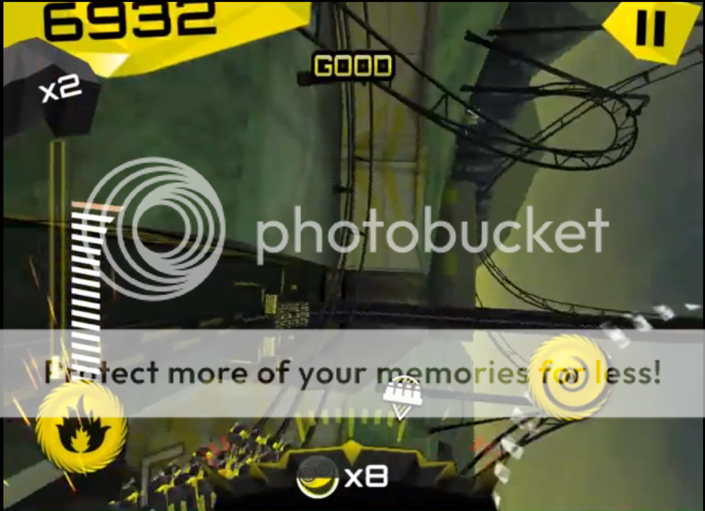
In this frame we get a few roller coaster elements confirmed:
- Indoor heartline
- Inverted drop
- Batwing x 2
- Camelback to inline
Also as pointed by many, there are two additional inversions shown in this video that are not shown on the original plans. Conclusive proof from Alton Towers themselves that the plans submitted are not accurate.
Here you can see a part of the exterior of the station again, showing quite a big change to the look of it compared to the original plans. We can see what looks to be like yellow piping on the station...
As we return to the station more of the cosmetic changes to the station can be seen.
Miscellaneous
This aren't pictures that have much to talk about, but still might be of interest.
Just to end it off, here's the lovely Alton Towers logo with a Smiler twist.
Certainly this ride has got a lot of changes compared to the plans, so it makes you wonder what else Alton Towers have in store for us come May!