• ℹ️ Heads up...

    This is a popular topic that is fast moving Guest - before posting, please ensure that you check out the first post in the topic for a quick reminder of guidelines, and importantly a summary of the known facts and information so far. Thanks.

[The Smiler] Train Speculation

Status
This topic has been locked. No further replies can be posted.
Rob said:
Alastair said:
Rob said:
A slightly random point, would I be correct in saying this is the first Gerstlauer to have OTSRs that are not black? World's first Gerstlauer with coloured restraints anyone? ;)

Nope, Untamed has brown restraints: :p

8chmo00ck9b8f1ke25d84k.jpg

Damn! World's first Gertlauer with bright colourful restraints? Or is that pushing it too much? :p

No I think if you dress it up a bit, and get Dale Winton to do the promotion then you might be onto something ;)
 
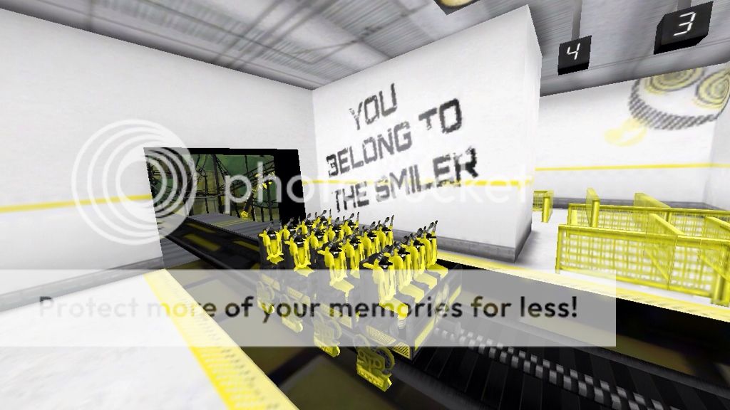
Not sure whether anyone's noticed this, but here's what The Smiler's trains look like in the game:

9AAA1486-205F-43F9-9F4A-C14CC8218EA1-1460-0000009B44F62EF9.jpg


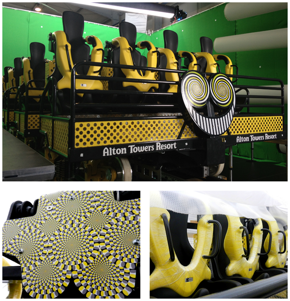
And this is them in real life:

BGdpAuGCAAAytmq.png


The only noticeable difference seems to be the optical illusion on the back of the trains, though that could be one of the unlockables in May.

So...yeah. Looks like the real trains have been staring us in the face for about a month now.
 
I for one expected the trains to look exactly like they do in the game, therefore I am fine with everything.
Having the logo on the front is something I never noticed, so that's a nice surprise.

Also, wires coming out of the headrests? Please, chavs would rip those out within the first week.
 
TheMan said:
Meat Pie said:
Tim - I find you very rude also. In terms of tone, I give exactly back what you emit. :)

I've just had enough, even after you are proved categorically wrong, you can't accept it's a mistake on your part and that marketeers and graphic designers did their job well, instead you have to invent that they've been inaccurate.

There was nothing in those original images that showed a lap-bar, and finally we have proof. Give it up.

Hey hang on m...ate (lol), you are being out of order and far too cock sure.

I usually defend your posts, but Tim has expressed disappointment that some great theme elements that were present on promotional images, (actually a COMPLIMENT), were not used on the car design itself.

Way, way too much gloating going on around here - I loved the idea of lapbars, but it's OTSRs, well done those who stayed to their points. Many of you were convinced that camera image had NOTHING to do with the inversion number either...

Good gracious me, talk about pruning your feathers pmsl!

As for the trains, compared to that image we all were having a good mooch at these are no where near as good. That I believe is what is being said here. The others looked far more like some kind of contraption, these, er, don't.

Oooooooooh they have yellow - and that's about the difference other than two extra rows from Saw. Oh, and a Smiley face.

I am really, really not that arsed whether it was Lap Bars or OTSR's (before anyone argues, read my previous posts), I was however convinced it would be Lap Bars - and had a bit of tongue in cheek fun about it all.

But the display in here of people waving their proverbial manhoods around, you'd think you'd never been right about anything before lol!!

Well done you, it's an inferior ride system and car design - gosh, you must be proud ;D

pmsl, honestly.

Oh hang on - let me buckle up (well, OTSR technically now) for a tirade of abuse as I dared to criticise something again... can't have that can we.

TheMan - What are you talking about? I think you've completely mixed up arguments. SirAlgenon was making a point about missing features from the original promotional art. Tim as he has throughout this issue was belittling the creatives behind the promotional image, this time by saying that concept artists couldn't possibly create an image as detailed and realist as one he pinned his whole flawed argument on.

I respectfully ask you to pay attention before jumping in to defend someone in an argument that was not even being had.

Tim said:
Meat Pie said:
Tim - I find you very rude also. In terms of tone, I give exactly back what you emit. :)

I've just had enough, even after you are proved categorically wrong, you can't accept it's a mistake on your part and that marketeers and graphic designers did their job well, instead you have to invent that they've been inaccurate.

There was nothing in those original images that showed a lap-bar, and finally we have proof. Give it up.

No Meat. When I say things I don't try to make people feel insulted so that they respond. That is rude!

and you assume way to much. I have never once insulted the work of designers (having done some myself) yet you come out with all this "low-regard for their professions" non-scenes.

And yes I said I was wrong! From the very beginning I've pushed the ideas of Lap Bars but always said that the proof will be when we see the trains. We have now seen the trains and I admitted the theory was incorrect by not trying to push it.


Sorry to go slightly off topic but felt it needed saying.


Tim - No... Of course not. What you do is consistently insult the competence of people not here to defend their creations, even when you are the one who has made error.
 
They're ok, but far from special.

The shape is pretty ugly, like rectangular metal boxes stuck one in front of the other. They try and replicate the sleek stylistic design of the Oblivion shuttles but ultimately fail.

Also, they look big and clunky, I can only really imagine them clambering around the track. Expect major Gerstache.
 
Tim said:
Well I genuinely did think the trains would look like the ones shown. I'd be fascinated to know were that design actually came from because it was far to detailed and realistic to have just been some concept art.


Meat Pie said:
TheMan - What are you talking about? I think you've completely mixed up arguments.

No what I am saying is, that was incredibly detailed to be concept art, especially concept art that ended up nothing like the actual product, the B&M restraints ones being more akin to what actually was created.

Even I find that strange.

I've not really found anyone that has been that harsh on any of the designs, and I've been stuck into this debate as everyone well knows lol!

I far preferred those trains, and like Tim I'd absolutely love to know where they came from. Makes no sense for a concept train released first, to then have something totally different closer to opening on their really major campaign in the papers.

That makes no sense no matter which way up you look at it. It isn't a slur on anyone, it's a genuine question based on things that happened.

Those trains looked brilliant silhouetted. Really stunningly beautiful.

EDIT:
Just to annoy everyone, we have only seen one train.

Maybe the world's first is, you can CHOOSE to ride lapbars or OTSR? ;D

Now, that is unlikely to say the least lol, but come on - imagine that ;D
 
Anyone else think the trains look a little bit like old style hospital beds? With the bars on the front and everything? Would fit with the mental institute theme of the sanctuary, and could potentially imply that the ride doesn't exist and the ride is just what getting marmalized feels like while you sit in a hospital bed? Or, am I being too optimistic (as always) ? :twirly:
 
These are quite obviously photoshopped and I am still certain the real trains will have lap bars.


Sent from my iPhone using Tapatalk
 
I can’t believe I made a simple comment about wanting to see where the image from The Sun came from but it’s been blown so badly out of proportion. But apparently I think all designers are incapable of doing their jobs because I think one image came from something that was real. As I said it could have just been a model used to mock up several car designs.

Meat Pie I refuse to continue this debate until you stop making your own interpretation on what I’m actually saying. It just comes across as insulting.

However I don't think you will so this’ll probably be my final word on the matter :(


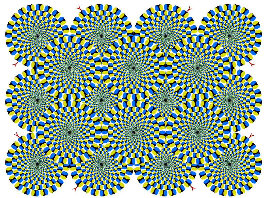
Changing the subject I hope they release an image of the full train from behind soon. I'd be interested to see how that hypnotic thing looks going all the way across, not just one seat.
 
That illusion on the back has been kicking round the Internet for years. Always been one of my favourates.

here's the image, which helps show the full effect.

Optical-illusion-wheels-circles-rotating.png


I can stare at this for hours. Wether it will be as effective when speeding round 14 inversions remains to be seen
 
We only have one photo to go on, so perhaps this is a bit unfair, but here are my first impressions.

I imagine these will look perfectly fine out on track. In fact, they'll probably look pretty good. Hopefully the angle of that photo just doesn't show the train at its best, as the bottom sections with the yellow mesh look really bulky and wide compared to the length of each car. It makes me wonder whether the effect would be reduced if those areas were painted entirely black.

I'm not keen on the inclusion of the word "Resort" on the front car. It looks out of place to me; I think it's because obviously the ride is in the park, and most people simply refer to the park as Alton Towers. I also think something about the Smiler logo on there looks somewhat tacky, though again that may be down to this specific photo.

I find that Gerstlauer's OTSRs aren't the most comfortable in the business, so to see the usual design on there is slightly disappointing. I seem to recall that they sit tightly on my legs, yet leave a fair bit of space around my chest (though that's definitely preferable to Vekoma's "RESTRICT EVERYTHING!" design for the SLC!). As Dave said, Gerstache is usually more down to force and track joint than ear-restraint contact, but the Dare Devil Dive type still would've been my preference.

Aside from the restraints I'm expecting these trains to give a good ride experience. The row spacing looks quite wide to give the flexibility required for the inversions, so with that and the lack of bodywork I think there's the potential for them to make riders feel very exposed on-ride.
 
Sorry if this is already been mentioned, but that train seems to be surround by a green screen. Maybe filming for adverts is taking place.
 
Correct me if I am wrong, but I'd this the first train at towers to have 'Alton Towers RESORT' on the front? Purely out of interest...
 
The use of "Resort" is the same as what as on the London posters. I think that the resort is probably rebranding itself a little and aiming to push "Resort" more. As for having the company name of it I'm sure it'll only be the third coaster to have named on its trains? First being Spinball, then Th13teen. I don't think Rita, RMT, or any of the B&Ms have it...
 
Air does not. However the art-style promotional image for Air shows the words "Alton Towers" on the trains for some reason (most likely for external use reasons I would assume).

air_zpsb793791c.jpg
 
James said:
Air does not. However the art-style promotional image for Air shows the words "Alton Towers" on the trains for some reason (most likely for external use reasons I would assume).

air_zpsb793791c.jpg

Nearly every piece of Alton Towers promotional images has Alton Towers on it somewhere whether it be the logo or the text
 
I'm not overly enamored by these trains really. They look a bit crude and boxy to me. The seats and restraints are just a slight variation on the ones used in their Eurofighters. It all confirms what I have often thought, that Gerstlauer are miles behind their competitors when it comes to train, seat and restraint design.

B&M set a new standard for sitdown trains with Kumba. That was 20 years ago now and I'm not sure that these trains even meet that standard. Whilst everyone else is moving into lap bars and flexible vests, Gerstlaur keeps using its uncomfortable, restrictive moulded OTSR which are a product of the 70s.

I know it seems like I'm being miserable and having a moan for the sake of it but I do believe that these trains are sub-standard and as riders we deserve and should demand better.
 
CGM said:
B&M set a new standard for sitdown trains with Kumba. That was 20 years ago now and I'm not sure that these trains even meet that standard. Whilst everyone else is moving into lap bars and flexible vests, Gerstlaur keeps using its uncomfortable, restrictive moulded OTSR which are a product of the 70s.

I don't think that's particularly true to be honest. I'll admit, I was the biggest advocate of lapbars on this but saying that "everyone else is moving into lapbars" is a bit over the top. What B&M coaster with inversions has lapbars? For that matter, what Intamin coaster with inversions have lapbars? Strangely enough, I'm pretty sure it's 0 in both cases. Gerstlauer, Maurer and Mack are the only major companies to produce lapbars on inverting steel coasters, and none have ever produced a coaster with upwards of 7 inversions - 14/15 is utterly unprecedented and perhaps lapbars were unfeasible?

And flexible vests? Available on B&M Wing Riders + fliers only? Would anyone in a million years have expected one on here?
 
Status
This topic has been locked. No further replies can be posted.
Top