- News all the latest
- Theme Park explore the park
- Resort tour the resort
- Future looking forward
- History looking back
- Community and meetups
-
ℹ️ Heads up...
This is a popular topic that is fast moving Guest - before posting, please ensure that you check out the first post in the topic for a quick reminder of guidelines, and importantly a summary of the known facts and information so far. Thanks. - Thread starter Ted
- Start date
- Status
- This topic has been locked. No further replies can be posted.
- Favourite Ride
- blue fire Megacoaster
- Favourite Ride
- Taron
- Favourite Ride
- Steel Vengeance, Cedar Point
- Status
- This topic has been locked. No further replies can be posted.
You are using an out of date browser. It may not display this or other websites correctly.
You should upgrade or use an alternative browser.
You should upgrade or use an alternative browser.
Thorpe Park: General Discussion
Sam
TS Member
josht said:
Yeah well done thorpe well done
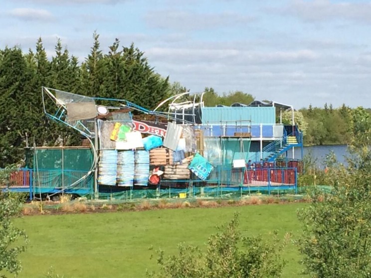
Handy that some of the signage used in construction also indicates what object would improve the hotel.
DETONATOR.
N
_nemesis_
Wow. Can't think of much else to say really. 
Hate to use the 'It's not even finished yet' argument, but....
It's not even finished yet.
There's a lot more to be added; more cladding, coaster-track-ribs, teeth, lighting, etc. It's not even half-finished I'd wager.
I've always liked the look of the shark, being my favourite of the three concepts the park showed on FB. Looking forward to the final result!
It's not even finished yet.
There's a lot more to be added; more cladding, coaster-track-ribs, teeth, lighting, etc. It's not even half-finished I'd wager.
I've always liked the look of the shark, being my favourite of the three concepts the park showed on FB. Looking forward to the final result!
Laura
TS Member
I agree with Rowe, it looks like someone had a great idea for an art installation but it isn't quite working out how they wanted!
Although it's not finished I can see this ending up like one of my 'art' projects, where I start adding random stuff or covering the entire thing in glitter in a desperate attempt to bring the piece together.
Although it's not finished I can see this ending up like one of my 'art' projects, where I start adding random stuff or covering the entire thing in glitter in a desperate attempt to bring the piece together.
Dar
TS Member
It doesn't really matter if it's finished or not, it looks naff. A shark made out of rubbish left in the service yards isn't good theming, it's lazy theming. It doesn't even look very "shark-shaped"!
Coupled with the rubbish looking "hotel" and this is something I would expect to see at Pleasurewood Hills. This can't have cost much and it looks horrible.
One night in this "hotel" on the 20th May, without entry, costs £69. The same night in the Big Blue Hotel at Pleasure Beach Blackpool costs £60. There's no value here, it's just blatant money grabbing.
AstroDan
TS Team
JoshC. said:Hate to use the 'It's not even finished yet' argument, but....
It's not even finished yet.
There's a lot more to be added; more cladding, coaster-track-ribs, teeth, lighting, etc. It's not even half-finished I'd wager.
I've always liked the look of the shark, being my favourite of the three concepts the park showed on FB. Looking forward to the final result!
I don't buy this at all.
It's trashy. The whole complex is trashy.
Why does anybody settle for this cheap dross?

