• ℹ️ Heads up...

    This is a popular topic that is fast moving Guest - before posting, please ensure that you check out the first post in the topic for a quick reminder of guidelines, and importantly a summary of the known facts and information so far. Thanks.

X-Sector Developments (Including Oblivion)

Status
This topic has been locked. No further replies can be posted.
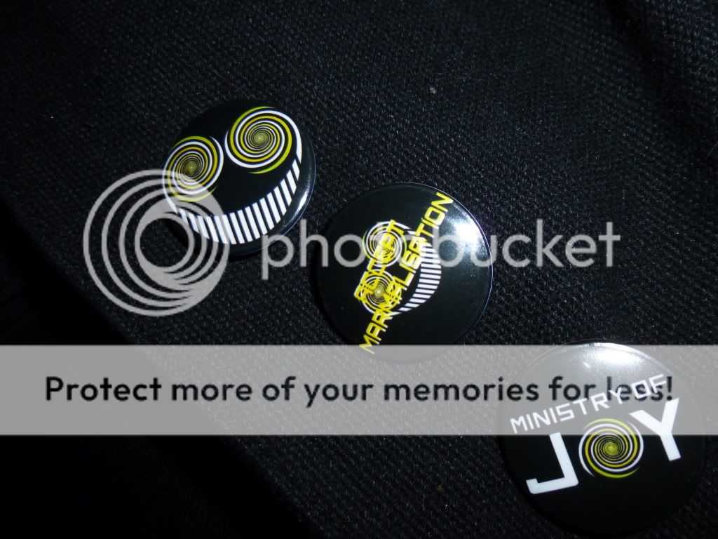
Thought I’d continue the discussion of the Smiler logo on top of Rehydrator here as this topic is more appropriate for it.

My issue with this logo being the focal point in front of Oblivions drop is that It kind of feels like they're advertising The Smiler while you're on Oblivion. Sort of like saying "you know what you should be riding? not the ride you are currently on."

Of course it's better than the Fanta advert but I think I preferred the old Coke advert; it didn't feel out of place*. Makes me slightly worried that they might be planning a complete takeover of X-Sector with the Ministry of Joy smiling theme (ala. Thunder Rock Valley) rather than letting them exist side by side. Oblivion's logo is still just as important as The Smiler's isn't it?


*= Fanta having a bright and jolly theme and the Smiler's yellow colour scheme encroaching on what is a building within Oblivion's orange part of X-Sector.
 
Anyone complaining about this is mad, mad I say!

It looks awesome. The style fits, the colours fit, and it isn't trying to sell me anything. Most guests will not see this as an advert for another ride, they'll see it for what it is - a quirky bit of detail that helps the ride to blend in with the immediate surrounding area.
 
Then I'm mad :twirly:

But what you've highlighted is exactly my point. The style doesn't fit because they’ve taken the logo from the wrong ride and put it on a building which is clearly linked with Oblivion’s hole. The colour doesn't fit, again because it should have Oblivion's colour scheme of orange on black not The Smilers colour scheme of yellow and white on black.

Your last point of it not trying to sell you something is fair enough but adverts aren't necessaries a bad thing and something not being an advert doesn't automatically mean it's good.
 
Personally, I kinda thought they were going to put on the Smiler logo as soon as we saw that photo with them seeing to the Fanta logo. Still, it is better than that stupid Fanta logo and and a light hearted note, the drop will be a bit more humorous with it there. :p
 
I find it odd that small complaints are being made about the park actually removing obtrusive advertising. I remember the outcry when the fanta themeing was added and the widescale demands about removing it so struggle to understand why there should be a negative reaction to it being removed.

I must admit I had hardly ever noticed the top of the building when hanging off the top of Oblivion, so I don't think the average person will see the new logo. However, I would rather the park advertise one of their own "brands" than an external company in the off chance that it is glimpsed by anyone.

In news that will keep a lot of people happy though, it appears that the "DONT LOOK DOWN" logo has been repainted on the floor of the drop zone. It may just be me, but I swear it hasn't looked quite that striking for a while. The same looks to have happened on the entrance sign and around the ride. It looks quite clean to be honest! A nice change!
 
I don't think anyone would prefer the Fanta advert :p

I just felt it needed noting that what they are replacing it with doesn't really make sense when you consider that the only time you'll see it is when riding Oblivion and yet it is The Smiler's Logo. That'd be like plastering Air's tunnel with the words Nemesis; It's an improvement but doesn't really fit in where it is.
 
My first thought about The Smiler logo on the Rehydrator was that it's on the wrong ride, then I realised there is a huge Oblivion logo painted on the floor - two might look a bit OTT.

It's WAY better than Fanta and it fits the X-Sector theme. A lot of people seem to forget that theme park themeing has a much more subliminal effect on the GP than us lot, and as it happens I think subliminal messaging fits well with The Smiler.

Something I've noticed on the TTF update, is that sand in the Blivvy hole pit ready for more repaving?
 
Towers freak said:
Just noticed there is a small structure being put up behind the Fried Chicken Co. Has anyone got any ideas what it could be for?

If it is where I think you mean, then it was used for outdoor seating to eat food in previous years. Whenever I walk past it I always say about how stupid it is because most of the time the seats are wet so cannot be used. When they put it in I always said it should of been covered up with the option of taking the canopy off on a good day - looks like that may actually be happening now.
 
The Smiler logo on Oblivion's roof is great.

It's a million times better than an ad on the roof for Coke or Fanta. They're still using it as an ad spot, rather than a theming element, it's just they're advertising their own attraction, rather than a random product.
 
I would of liked to see

ministry of
joy

with the O replace with a round spin thing like the eye of the smiler, replacing the fanta logo.
 
DiogoJ42 said:
And how the hell are they going to enforce that when 40 TSTers turn up with DSLRs?
Will they be strip searching everyone who enters X Sector and confiscating all electronic devices? Will there be snipers on the top of Oblivion to pick off anyone holding a phone?

Even Morewonga wouldn't have come out with something as daft as that. Punters posting pictures on social media is the best free publicity they can get, and they know it.

This comment couldn't have been any funnier.

Except when I thought about them trying to stop Rowe taking pictures ;D

I was going to wish them good luck with that if it wasn't a joke. Sorry topic moved on, but having witnessed first hand the sheer amount of recording devices flashing around on meets, I found this brilliantly funny to imagine.

That will tickle me all night ;D

Should have a warning message on meets: "Not suitable for the camera shy".

:twirly:
 
Think of it as "MOJ" & The Smiler intruding X-Sector then it fits pretty well in my opinion. Rather than thinking "Random logo plonked on a completely different ride" haha.
 
But the smiling logo is not the Ministry of Joys logo, it is The Smiler's (hence the name). The bottem badge in this image is MoJ's logo:

P1010440.jpg


If that had been put on the top of the building I wouldn't have even brought up the subject. If they had altered it so that the yellow is orange to match Oblivion I'd have probably praised it.

But I stress again it is still much better than the Fanta advert, I just believe they could have done even better.
 
Notice they have now removed all the explicit Fanta sponsorship from Oblivion; there were still posters around Oblivion's drop last year. Maybe they will finally remove the rest of the Coca-Cola sponsorship too? Please? And at a guess the trench in the drop zone is for new drainage, since there is often a big puddle around that area.

Infuriatingly the ventilation pipes are still painted orange, which really undermines the look of the drop zone in my opinion. It's far too bright and colourful, although oblivion's jet black track now off-sets that effect considerably. It was unnecessary fiddling that resulted in orange pipes in the first place, so they should be restored black as soon as possible.

The Smiler's logo appearing on the Rehydrator is a bit novelty at the moment but in a few years it will look rather aimless being there. It has no relevance in that position and would have already been shoved in your face countless times during your day.

And personally I am uncomfortable with seeing a big garish swirly smile when I'm supposed to be feeling intimidated hanging on the brink of Oblivion.

Coca-Cola, Fanta, The Smiler, etc... It's an improvement over the old sponsorship but still just a logo on a building. If anything it should be Oblivion's logo (I still think that is where the "Don't Look Down" text should have gone). Or even better, a themed roof design in the cylindrical architecture style of the other buildings around X Sector.

But whatever, X Sector looks amazing this year. It has expanded by almost half its previous size and the ride line up is surely one of the best at Alton Towers. I can just imagine walking in with the Smiler's pulsating music floating in the air... :twirly:
 
Erm, because instead of an ugly blue tent there is now a stunningly complex metal sculpture of pure evil in its place.
 
CoasterCrazyChris said:
electricBlll said:
But whatever, X Sector looks amazing this year.

How do you know when the park hasn't even opened yet and the pictures still show half the area as a muddy construction site?

Half the area is a muddy construction site and will remain as such until May, yet the public don't have access to this area so what difference does it make? The other half, from pictures we can easily access on Towers Facebook or over on TTF show a much improved and quite frankly beautiful X-Sector :)
 
electricBlll said:
Erm, because instead of an ugly blue tent there is now a stunningly complex metal sculpture of pure evil in its place.

Oh yeah, The Smiler looks insane but I was thinking more the rest of the area itself.

Oblivion looks super repainted but everything else still looks very tired.
 
CoasterCrazyChris said:
Oblivion looks super repainted but everything else still looks very tired.
Well, let's say it is amazing in relation to what it has been for the past decade.

But I agree it looks tired. I think X Sector needs a rather drastic refurbishment sometime in the future, unless the 2013 refresh turns out to be more extensive than expected. Note: I'm talking about some kind of reimagination, NOT a retheme. The Oblivion and Smiler brands are strong enough not to be replaced for the duration of the rides' lifetimes.

However, when you look at the original concept art, there are aspects to X Sector that were dropped or did not materialise with the impact that was intended. Likewise there are many features that have been removed since opening in 1998, which has diluted the coherence of the theme. I am particularly thinking of the Rehydrator which never seemed to work as intended, and the function of Oblivion's queue to falsely "prepare" passengers for their ordeal, which has been lost. The Orwellian imagery and stylish architecture is clever but not executed as well as it could be. Stuff like the Fanta sponsorship, Fastrack fiddling with Oblivion's queue and now The Smiler's goofiness slightly encroaching all adds to the dilution of the theme.

If they could return to the original ideas, bringing X Sector closer to the intended concept than it ever has been and perhaps going further, while staying respectful to the familiar atmosphere, then it could really inject some life. Make the theme more dynamic and engaging for everybody who enters the area, rather than just being a vague backdrop to the rides.

It could be great if they put some real money and creativity into it.
 
electricBlll said:
CoasterCrazyChris said:
Oblivion looks super repainted but everything else still looks very tired.
Well, let's say it is amazing in relation to what it has been for the past decade.

But I agree it looks tired. I think X Sector needs a rather drastic refurbishment sometime in the future, unless the 2013 refresh turns out to be more extensive than expected. Note: I'm talking about some kind of reimagination, NOT a retheme. The Oblivion and Smiler brands are strong enough not to be replaced for the duration of the rides' lifetimes.

However, when you look at the original concept art, there are aspects to X Sector that were dropped or did not materialise with the impact that was intended. Likewise there are many features that have been removed since opening in 1998, which has diluted the coherence of the theme. I am particularly thinking of the Rehydrator which never seemed to work as intended, and the function of Oblivion's queue to falsely "prepare" passengers for their ordeal, which has been lost. The Orwellian imagery and stylish architecture is clever but not executed as well as it could be. Stuff like the Fanta sponsorship, Fastrack fiddling with Oblivion's queue and now The Smiler's goofiness slightly encroaching all adds to the dilution of the theme.

If they could return to the original ideas, bringing X Sector closer to the intended concept than it ever has been and perhaps going further, while staying respectful to the familiar atmosphere, then it could really inject some life. Make the theme more dynamic and engaging for everybody who enters the area, rather than just being a vague backdrop to the rides.

It could be great if they put some real money and creativity into it.

My main niggle is the drop zone. It looks horrendous. The fences for example were once a bright silver, whereas now they are rusty and dull grey. The concrete walls are filthy and grime streaked and painting the recessed logo's bright orange creates a really ugly contrast.

Then there's Oblivion's entrance, which is dire for a ride of such a status.

Of course, there are massive improvements too with The Smiler and the Oblivion repaint. But a 'full refurbishment' it is not.

:)
 
Status
This topic has been locked. No further replies can be posted.
Top