• ℹ️ Heads up...

    This is a popular topic that is fast moving Guest - before posting, please ensure that you check out the first post in the topic for a quick reminder of guidelines, and importantly a summary of the known facts and information so far. Thanks.

[2024] Thorpe Park: Hyperia - Mack Hypercoaster

On the theming piece, I'm not as bothered as others regarding lack of theming (and I love theming) probably because I associate coasters of this size more with stylised concepts than immersion... to those of you who are disappointed with the final look, what are some key features you'd have liked to have seen in the station/area?

Not a box for the station. Something, almost anything else, would be better.

Proper landscaping. I've not looked at the pics but if they're as bad as seems then maybe something around that.
 
Thorpe is an amusement park though, it isn’t trying to be towers or chessington
I’d disagree with that. Thorpe doesn’t do too badly when it comes to giving its coasters a visual identity through theming.

Stealth with its big tyre, racetrack theming and Amity location, Inferno with its volcano and palm trees, Swarm with its ruined church and vehicles, they are all pretty good. Compare those to what you see at a true amusement park like Fantasy Island, it’s really not the same at all. Thorpe is most definitely a theme park.
 
I’ve never bought into the story of old Merlin not giving them the money for theming etc. The viewing area was in the plans and given the green light but was then dropped because they said it wasn’t practical because of the fencing and netting required - well why wasn’t that flagged up at the design stage?

They were given extra cash and that’s given us what we have today. It’s basic and gives World of Jumanji - to me it’s more like Magic Making were stretched doing Reborn & Hyperia in the same year and the excuse of old vs new Merlin is just a convenient excuse.
 
Last edited:
To me it’s more like Magic Making were stretched doing Reborn & Hyperia in the same year and the excuse of old vs new Merlin is just a convenient excuse.
I think this is true for both rides, had one or the other hadn't opened this year but in different years, who knows how different their respective theming jobs would have been?
 
I think we just need to accept that Thorpe Park is a six flags style amusement park. Think of it like that and the overall style of Hyperia is fine. Since they slam the brakes on half way through the ride, we can't expect them to properly theme it as well.
 
On the theming piece, I'm not as bothered as others regarding lack of theming (and I love theming) probably because I associate coasters of this size more with stylised concepts than immersion... to those of you who are disappointed with the final look, what are some key features you'd have liked to have seen in the station/area?

Is there a ride the same height, or taller, in Europe that has less design effort put into it's station?

Energylandia_10.jpg

wm_content_FerrariLand-1679.jpg

aacjxpa


Even Silver Star has something going on, and The Big One's station is pretty unique.

This idea that big ride equals no effort beyond hardware just doesn't stand up to much scrutiny. And if by 'size' you mean ride area, the ride area of Hyperia isn't much larger than Air and Swarm, and smaller than all of the above examples - none of which warranted no effort whatsoever because of it.
 
Jeez, that station looks awful. The lighting is cool, but you can't polish a turd and all that. I would love to see what Hyperia looks like without the extra new management money.

It’s hard to believe this and Reborn were designed/made by the same people.

The ride looks good, but a lot is left to be desired.
 
Each to their own, of course, but I don't personally agree with the overwhelmingly negative sentiment around Hyperia's theming, from what I've seen of it. I apologise if that's controversial, but that's my honest view from what I've seen.

I grant you, it doesn't look heavily themed, but I think the plaza, queue and station look perfectly nicely styled and landscaped, personally. For the most part, I think that the bits guests walk through look perfectly presentable and quite nicely done. I think the word "breathtaking", used in a previously embedded Facebook post, is more hyperbolic than I would personally go, but I think it looks nice enough. I quite like the gold around the area, I don't dislike the station exterior with the black and gold trim, I think the station interior has been done quite nicely, I quite like the dispatch sequence, and overall, I don't personally dislike it. Sure, it's not going to blow any minds, but I don't think theming is really this coaster's primary USP.

If we're doing like-for-like station comparisons; I'd argue that I can think of at least 2 major coaster station interiors at Thorpe that I would say look no objectively better than Hyperia's. Stealth literally doesn't have one, and I don't see how Inferno's station interior is any better than Hyperia's seeing as that is also a tin shed with a dispatch sequence that I would argue is lower-calibre than Hyperia's.

With that being said, one thing I will say is that from what I've seen, I'm disappointed with how the area under the ride itself looks, particularly the lake with the splash effect. That splash effect looks like more of a damp squib every time I see it what with how it's hidden behind a huge fence, and I think the lake with the reeds growing in it and the muddy ride area look quite unkempt. I know that the area under a roller coaster is hardly going to be the Hanging Gardens of Babylon, but some grass or something and some semblance of a more tidy appearance might have been nice in this area. However, I concede that this probably won't be too much of a concern when you're on the ride itself, and it may begin to look a bit better once the ride has settled in a bit.

The one caveat I should add to all this is that I haven't seen it in person yet and am simply going off the photos and videos. When I do get to see it in person, I may hold a different opinion.
 
I can't disagree enough with the sentiment that hyper coasters generally lack theming on the scale of Brake Run. Shambhala and Silver Star both sit on much larger plots of land, and not a million miles away from this, and both have way more theming. Big One also sits on a large plot of land and is probably on a par, yet if was built 30 years ago, and what if lacks in screwed on sheet metal wings, it makes up for with a Pepsi Max can tunnel. Like the ride length, cigarette paint job, and lack of plaza, this has nothing to do with "practicalities", or "aesthetics", or hyper coasters not typically being heavily themed excuses. It looks like it has everything to do with £ Sterling.

They could easily have built something with greater length on that plot of land, with a Stealth style blended paint job, a viewing plaza, and a ride area that doesn't consist of mud. They chose not to because they wanted something unique that broke records for marketing hype, but just didn't have the cash to meet their ambitions.

That said, I'm not against it being stylised rather than comprehensively themed. Just it being done so sparingly, accompanied by excuses as to why. The half a layout that is there looks excellent, but I wouldn't get too excited over wined and dined social media types making rediclous claims on everyone elses behalf about it being "one of the best" or "the best" in the UK/world just yet. I can't even see how something so high and fast, yet plain and short, could be described as such right out the blocks, and be taken too seriously. I remember 5 mins ago when, within the first days of them opening, such claims were showered upon Wicker Man, Icon, Sik, and Rebo. Anything that's half decent is "probably the best" whilst opening hype is high.
 
Last edited:
I was at the VIP event tonight but I’m not a vlogger and have no vested interest in hyping the ride unnecessarily as I don’t need TP’s future support so here’s my honest take.

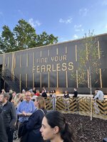
The ride area (the bits that have been finished anyway) is fine. The plaza’s quite nice (although it doesn’t feel overtly Thorpe) and my non-enthusiast friend liked the layout of the queue overlooking the banked first turn into the lift hill to build up the tension. The big problem is the queueline fencing is all thin sheetmetal - and will be scratched to buggery within days:

IMG_4910.jpeg

There was some unfinished landscaping on the approach to the plaza from Saw - and some disgruntled chuntering from enthusiasts.

The station is pretty plain but there’s a bit of smoke and an effective recorded announcement when you leave on the “find your fearless” theme.

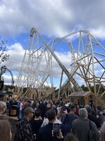
The ride itself is terrific and that’s all the public will care about. The lift seems like it goes on forever, really building up the anticipation, before the crazy first drop and relentless elements one after the other - including the stall which is probably the highlight. We were sat in row 3 and the ride experience was very smooth indeed.

IMG_4906.jpeg

Crucially, after months and months and months of chat about this here, Hyperia does not feel short. The pacing’s pretty good and we certainly didn’t feel short changed when we made it onto the brake run. Everyone coming into the station had massive smiles on their faces too - and I think we can assume Thorpe has a hit on its hands.

As an aside, the PR event was very well managed tonight so hopefully that bodes well for crowd control tomorrow. Hyperia was meant to be open for two-and-a-half hours tonight but did go down a couple of times and the dispatches weren’t lightning fast when it was running normally.

Overall though, terrific ride with imperfect styling that looks better in person.
 
I going to try and reserve judgement until I have visited next week but so glad it’s getting good reviews. It’s a mean feat of engineering if anything.

Regarding the themeing I’m guessing maybe Thorpe have realised there main clientele and target market - teenagers - don’t really value themeing and are there more for the “sick thrills innit”

Thorpes a strange one anyway with themeing. I think it never really knows whether it wants to be amusement style park or theme park. It will be interesting to see how the park forges out its future from this point onwards..

Anyway- big questions for anyone that’s ridden the thing- is it slow?
 
Top